Neighborly: Home Services
With Neighborly Brands team, redesigned web pages MVP to improve brand presence with the start of sub-brand, "ShelfGenie".

About
Neighborly is a home services brand with 20+ sub-brands, each specializing in a different area. Our team focused on ShelfGenie, which offers cabinet consulting and installation. We designed a flexible page template for ShelfGenie that could be adapted across all sub-brands on Neighborly.com. Working within tight timelines, we delivered quickly using agile methods and existing design systems.
My Role: UX/UI designer
Tools: Figma, Microsoft Teams, Microsoft 365, Google Office
Timeline: November - December 2022
(5 week sprint)
Team: Photon Team and Neighborly brand Stakeholders/Clients
The Problem
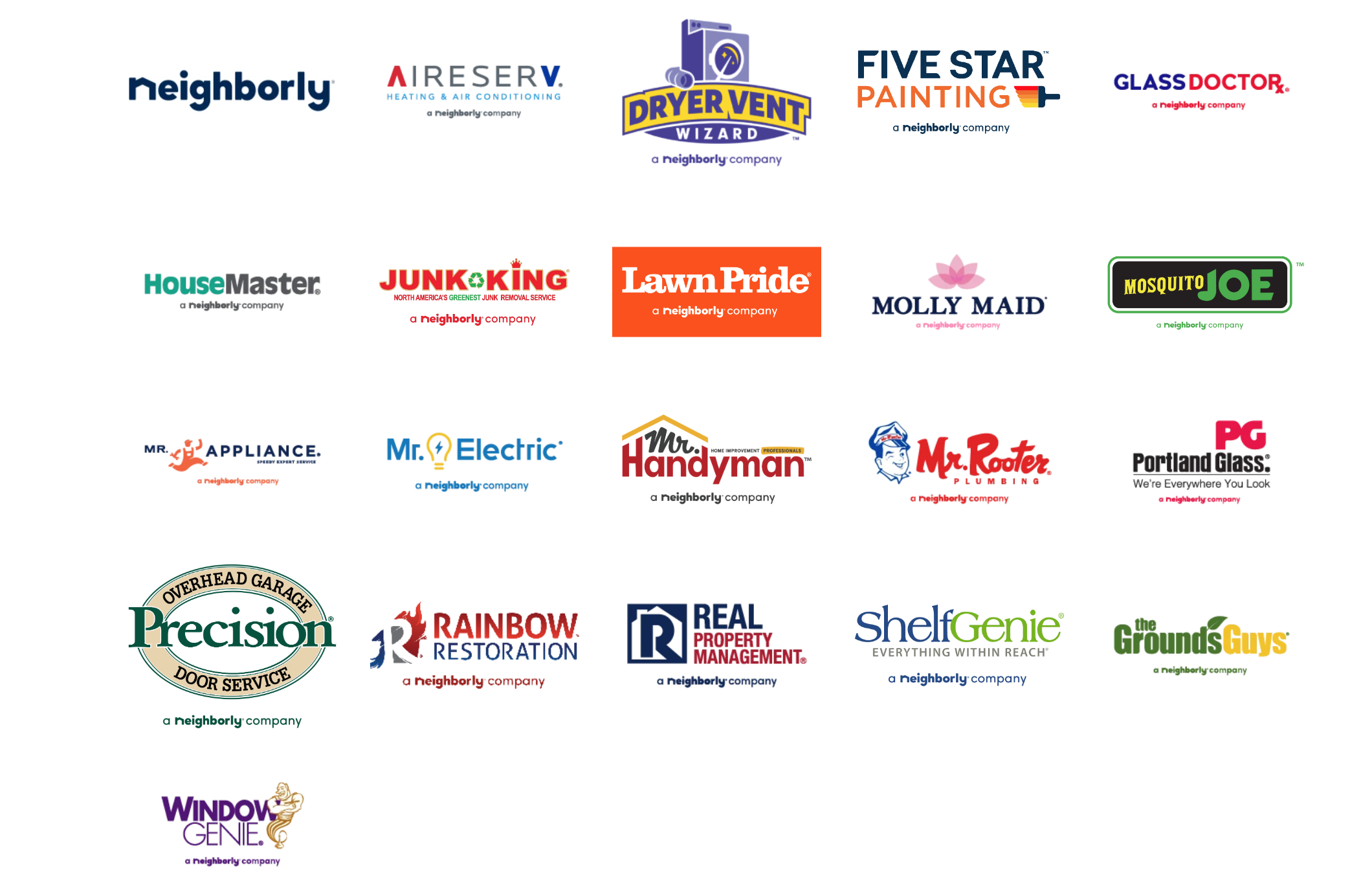
Neighborly brought together 20+ independently owned home service brands—many formerly mom-and-pop businesses—into one unified platform. This allows homeowners to easily request any service without searching multiple providers.
Since each sub-brand had its own identity, Neighborly aimed to create a consistent brand experience through a shared template. The Photon design team had already created a base template, and I joined the project to help design additional MVP pages as part of a sprint focused on ShelfGenie.
The Goals
Neighborly prioritized the following key features for the ShelfGenie experience:
“About Us” and “Why Choose Us” pages
Account creation and sign-up flows
Regional and local ShelfGenie homepages
Franchise opportunity page
Special offers section
Tiered service pages (Levels 1, 2, and 3)
Location finder page
Header, footer, and overall service flow design
"If we were to take these components from this page and put it into a template for all the sub brands, how should we organize it so that users are able to easily understand about the company?"
Sprint 1
Like most company websites, Neighborly wanted to include pages that introduce the brand and highlight why users should choose their services. Instead of combining these into one page, they chose to separate them to better showcase their value and build user trust.

While reviewing various sub-brand pages, we noticed many had either too much content or information that didn’t align with the page’s purpose. For example, Mr. Handyman’s page was detailed but overly text-heavy and hard to scan.
With ShelfGenie, our challenge was to maintain the brand’s identity while redesigning the layout to be more user-friendly and accessible.
Research

This led us to ask: “If we turn these components into a reusable template, how can we organize the content so users can quickly understand the company?”
New Designs
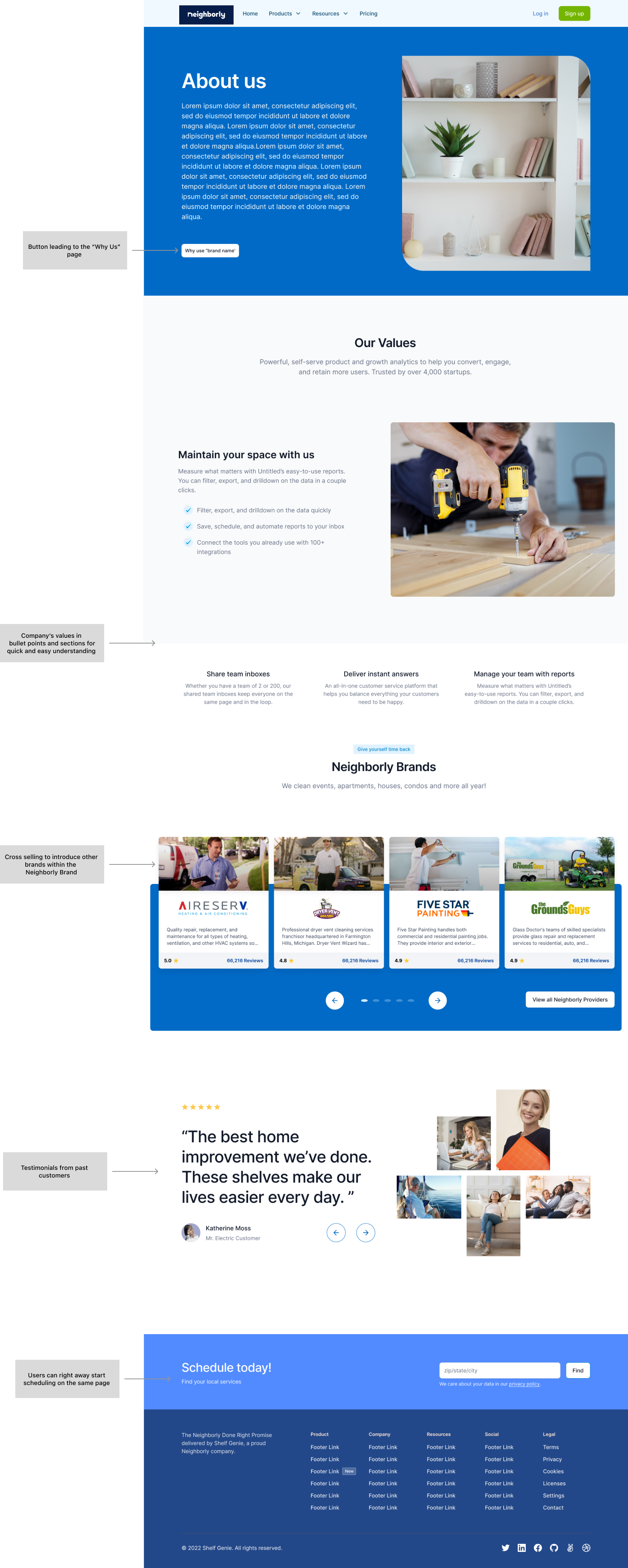
Based on our research, we identified a few key elements that should be included or carried over into the new “About Us” page.
About Us page
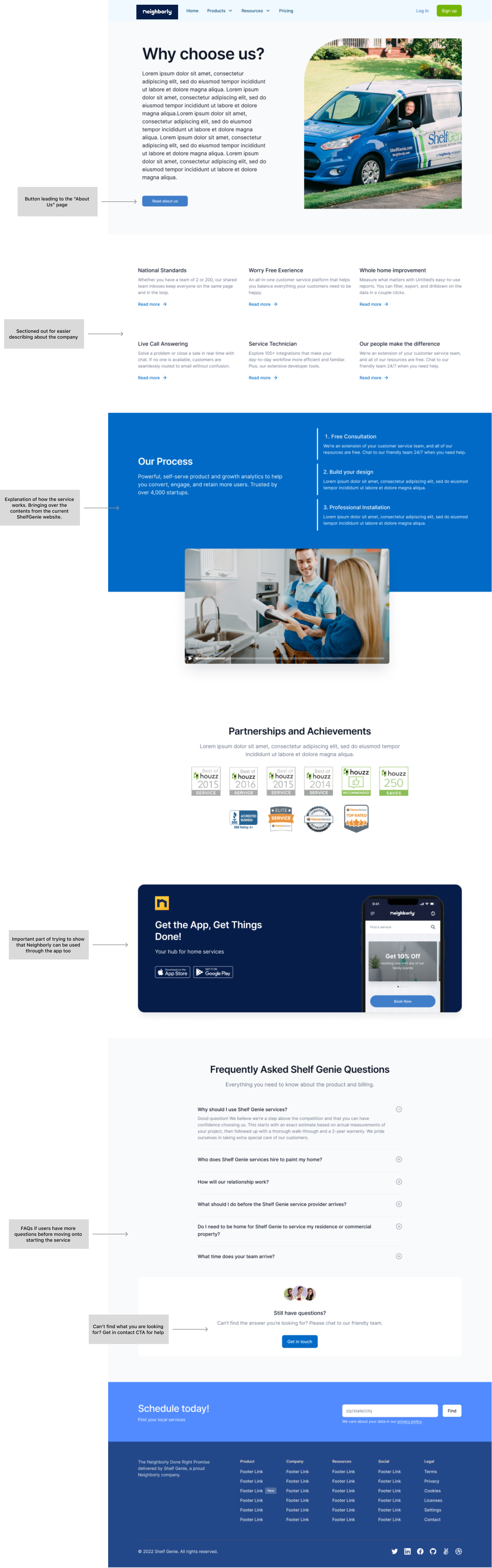
Since ShelfGenie didn’t have a dedicated "Why Us" page, we used the current existing ShelfGenie’s “Process page” as a starting point, since it already explained how the service works while also highlighting reasons to choose the brand.
To keep visual consistency with the "About Us" page, we followed similar layout, color use, sectioning, and overall styling.
Why Choose Us page
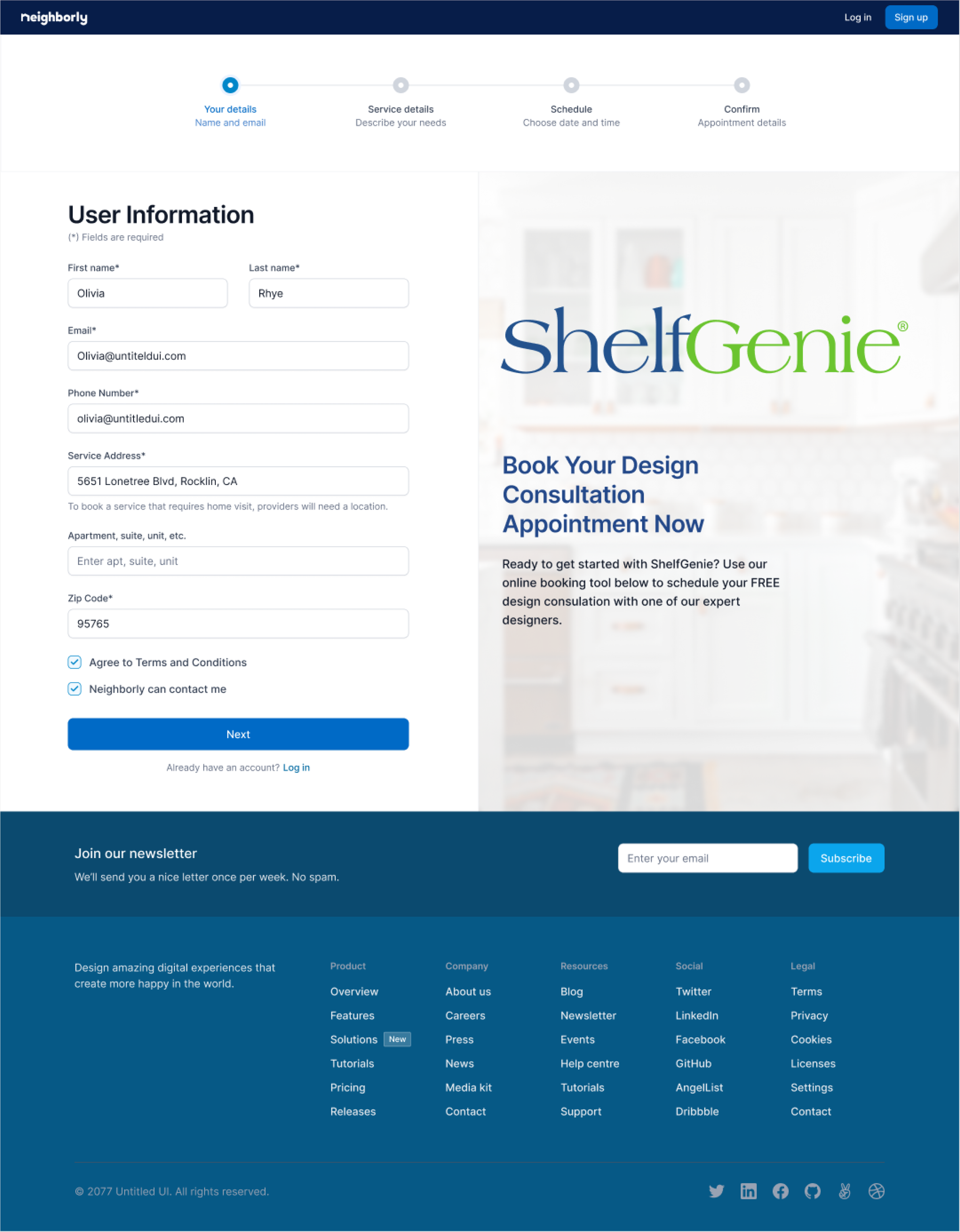
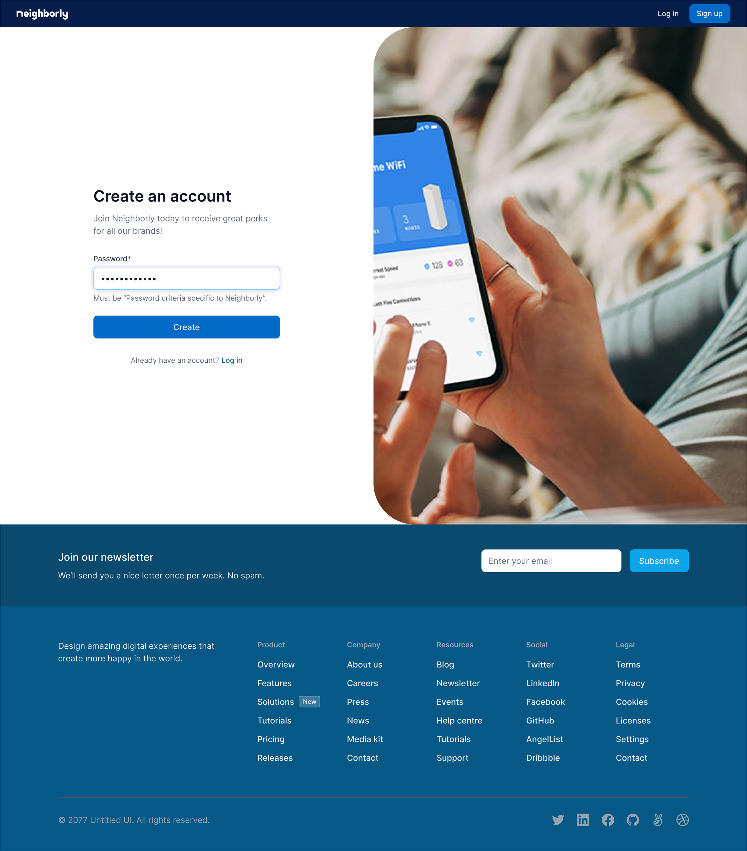
The account creation and login page is shared across all Neighborly brands, so it needed to reflect the overall Neighborly.com identity—not just one sub-brand—and align with the app experience as well.
While the current sign-up is a one-step process, it presents lists of much information, requiring users to scroll and potentially miss key fields.
Account Creation OLD page
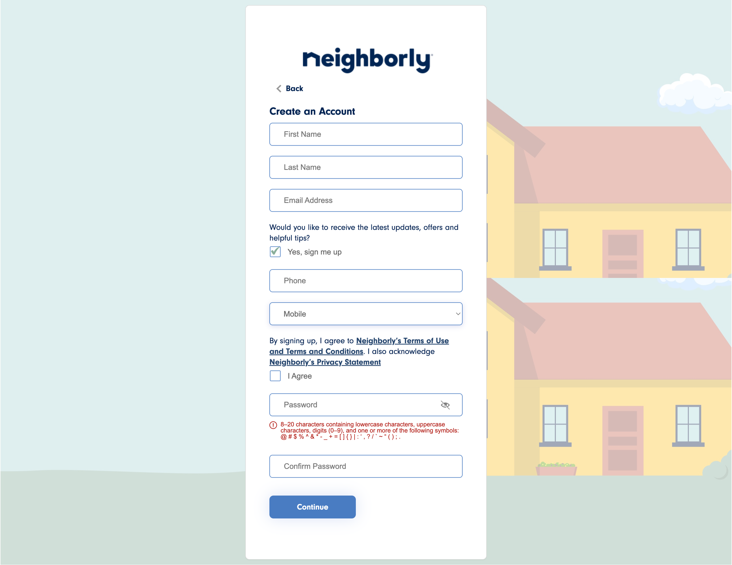

Breaking the sign-up process into smaller steps would reduce the need for scrolling and make the process feel more manageable. Using a pop-up modal instead of redirecting to a new page would also keep the experience more seamless and reduce unnecessary navigation.
Account Creation NEW pages
Sprint 2
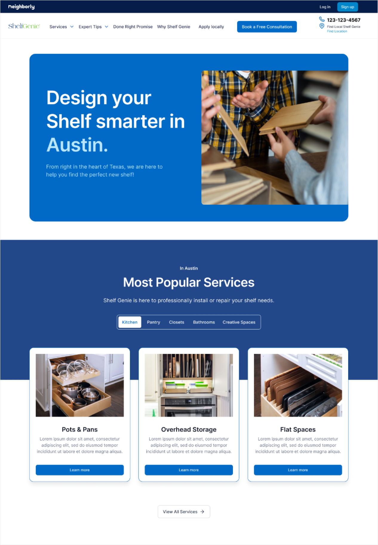
Since this sprint focused on MVP features, a base template for the new homepage had already been established. We pulled in key content from the existing ShelfGenie homepage and adapted it to fit the new structure, making necessary updates along the way.
Additionally, once a user enters their zip code, they should be redirected to a localized homepage tailored to services available in their specific area.
Regional & Local Homepage
The existing homepage and other pages often repeated the same information. Clients wanted to improve this by offering users tailored recommendations for popular services specific to each sub-brand.
ShelfGenie OLD Homepage
The new homepage layout removed unrelated content and focused on clearly introducing the brand to first-time users. It needed to quickly communicate what services are offered and how they work at a glance. To support this, we added popular services, personalized suggestions, and FAQs—helping users explore their options and encouraging cross-selling across other Neighborly sub-brands.
ShelfGenie NEW Homepage

New Homepage design
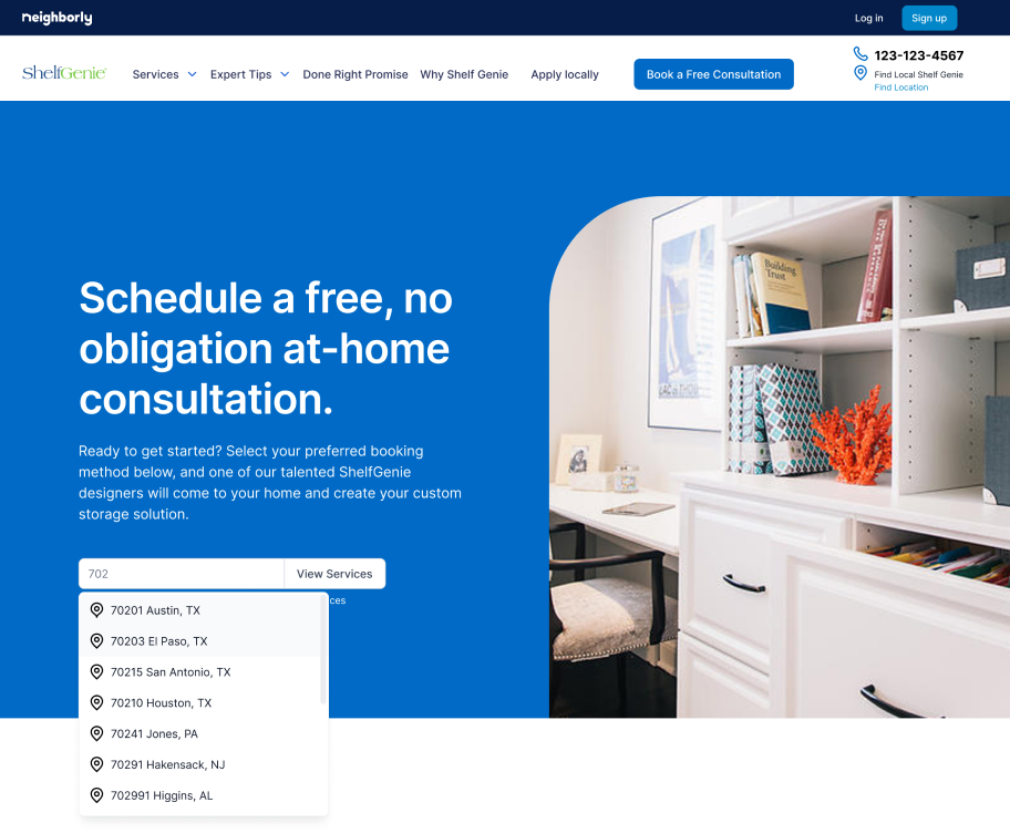
When users begin typing a zip code, a dropdown will automatically appear with suggested locations that match the input.
ShelfGenie NEW Search Area page
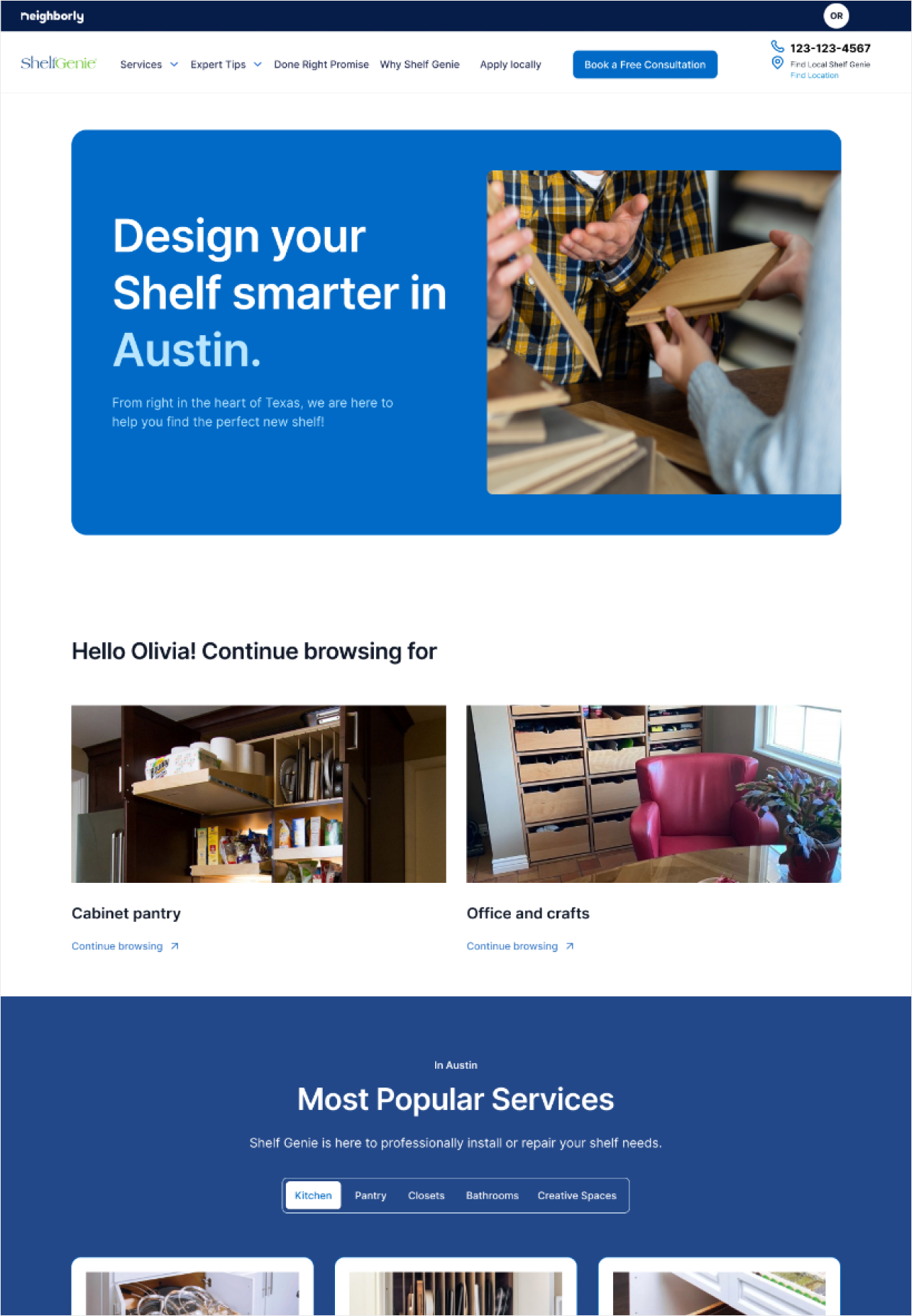
Once a user selects a service location, the header updates to display their local area. If the user is logged in, they’ll also see personalized recommendations based on their browsing history.
ShelfGenie NEW Local Homepage
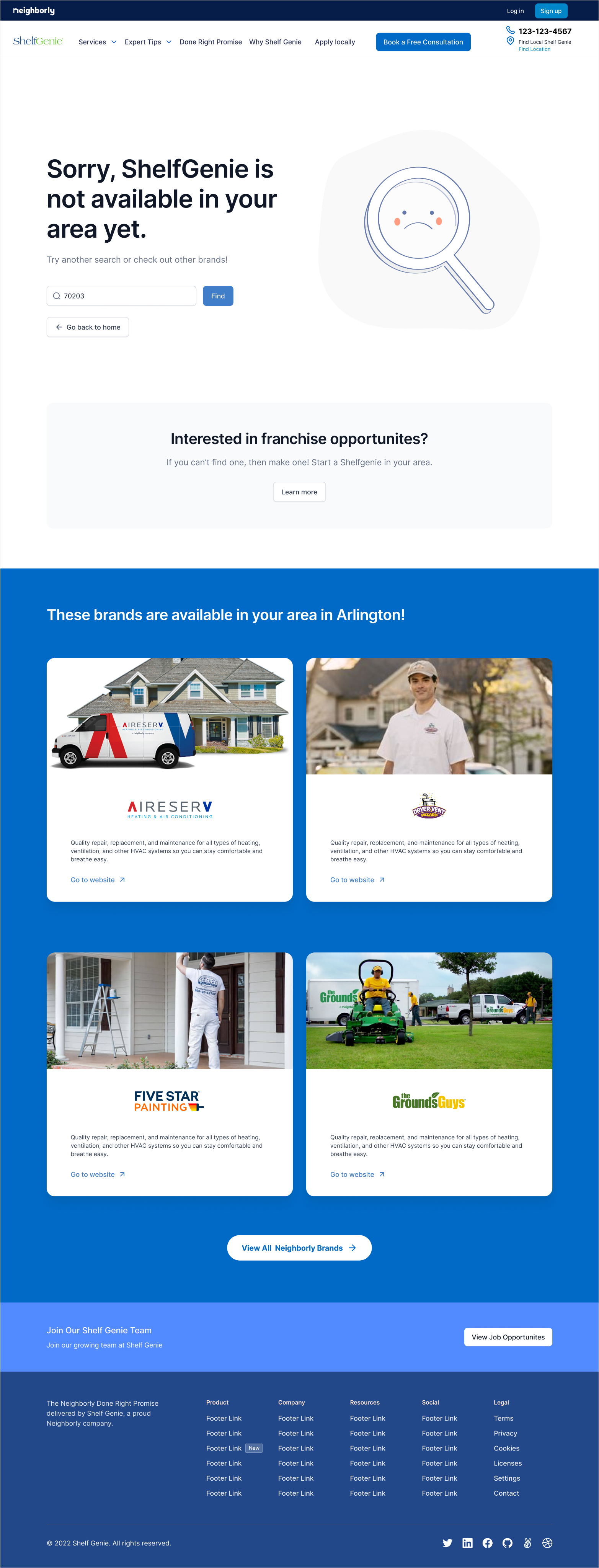
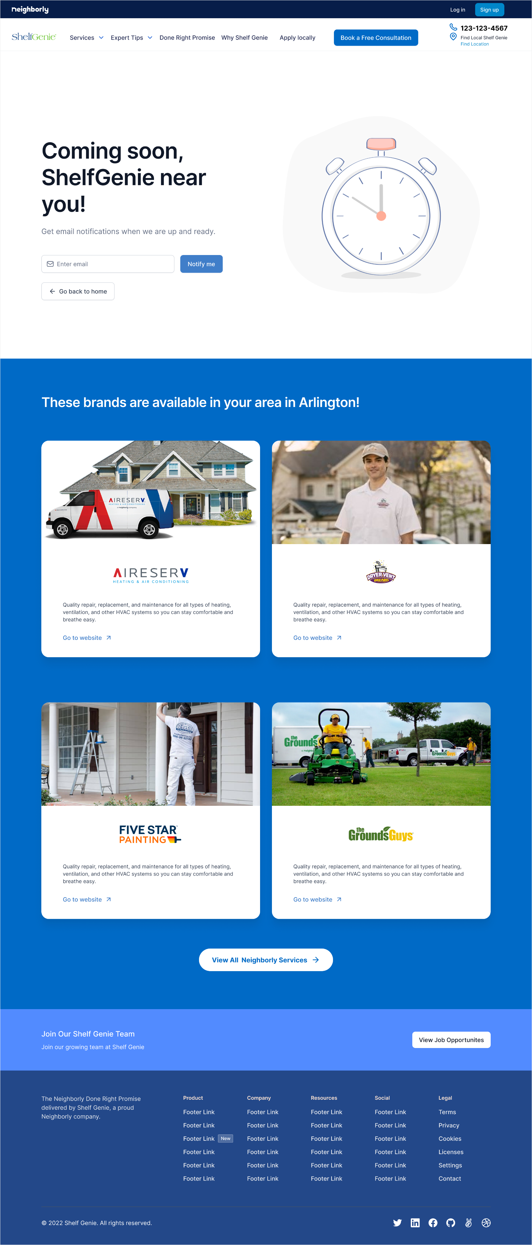
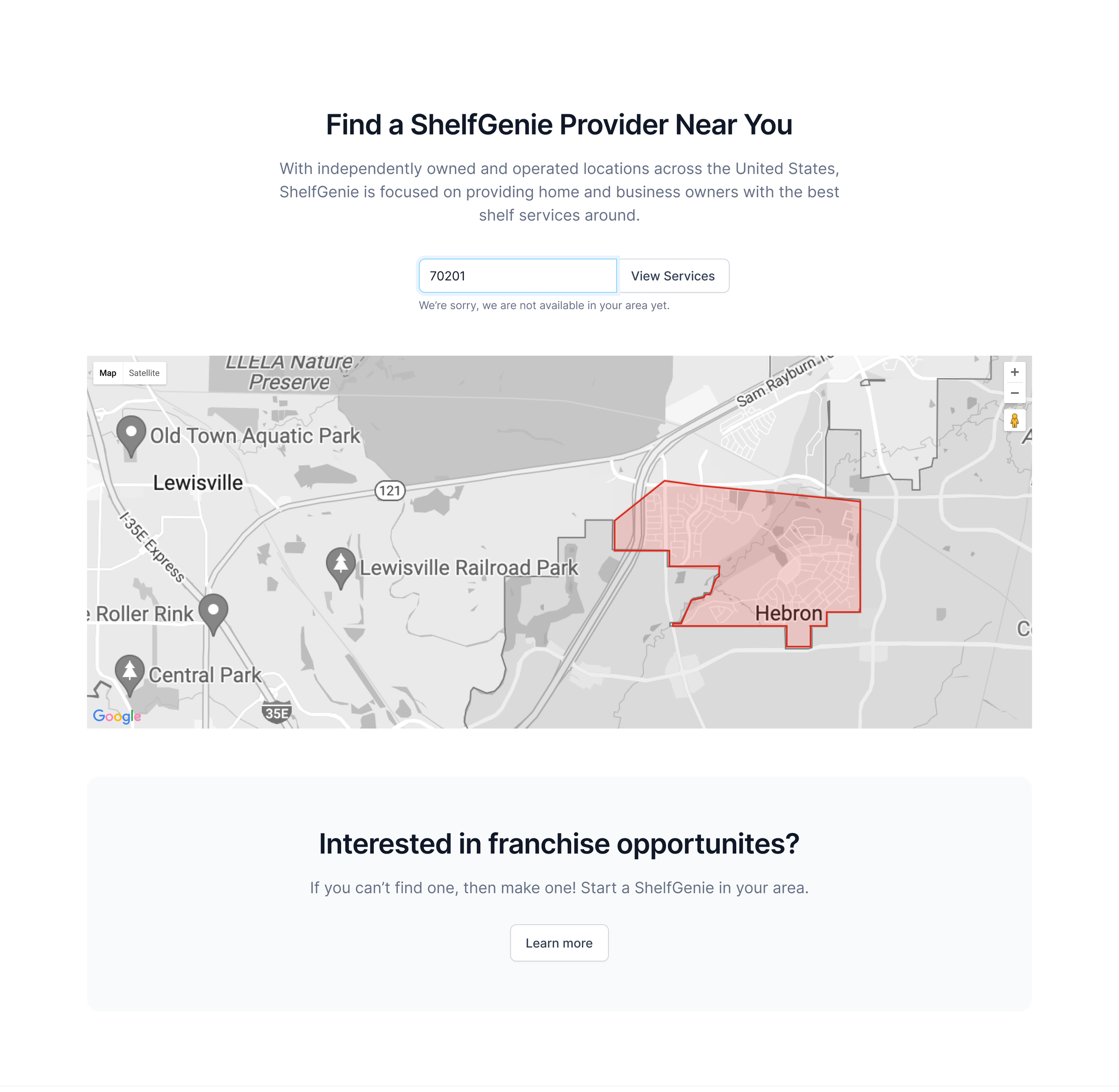
If no service is available in the entered area, a message will appear letting the user know. They’ll also see a suggestion to explore franchise opportunities in that region.
If service is coming soon, a “coming soon” message will be shown, along with an option to sign up for email notifications.
Additionally, the page will suggest other available services in nearby areas to encourage cross-selling.
ShelfGenie NEW Empty State
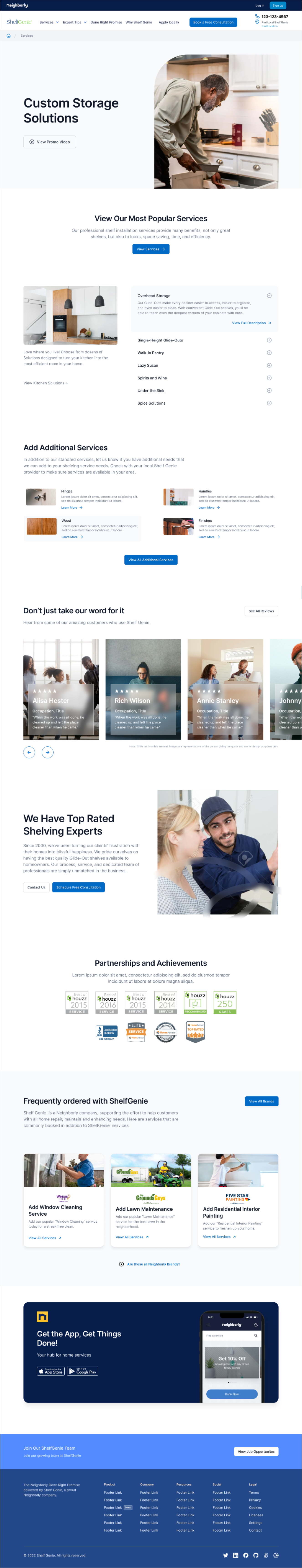
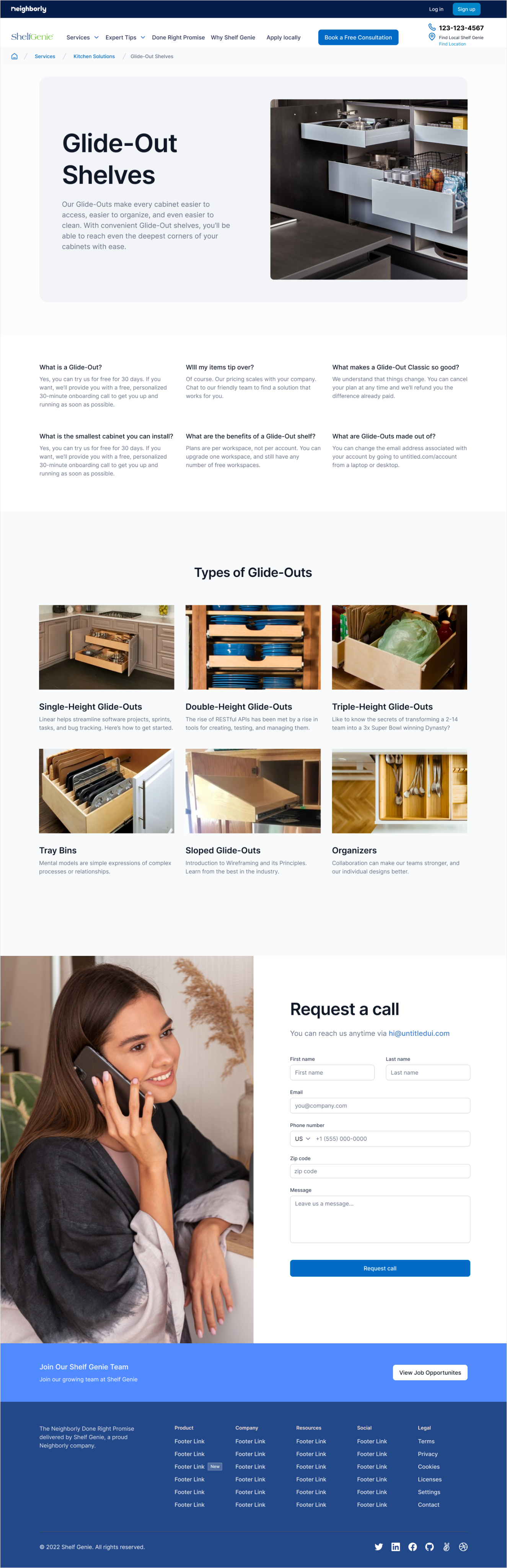
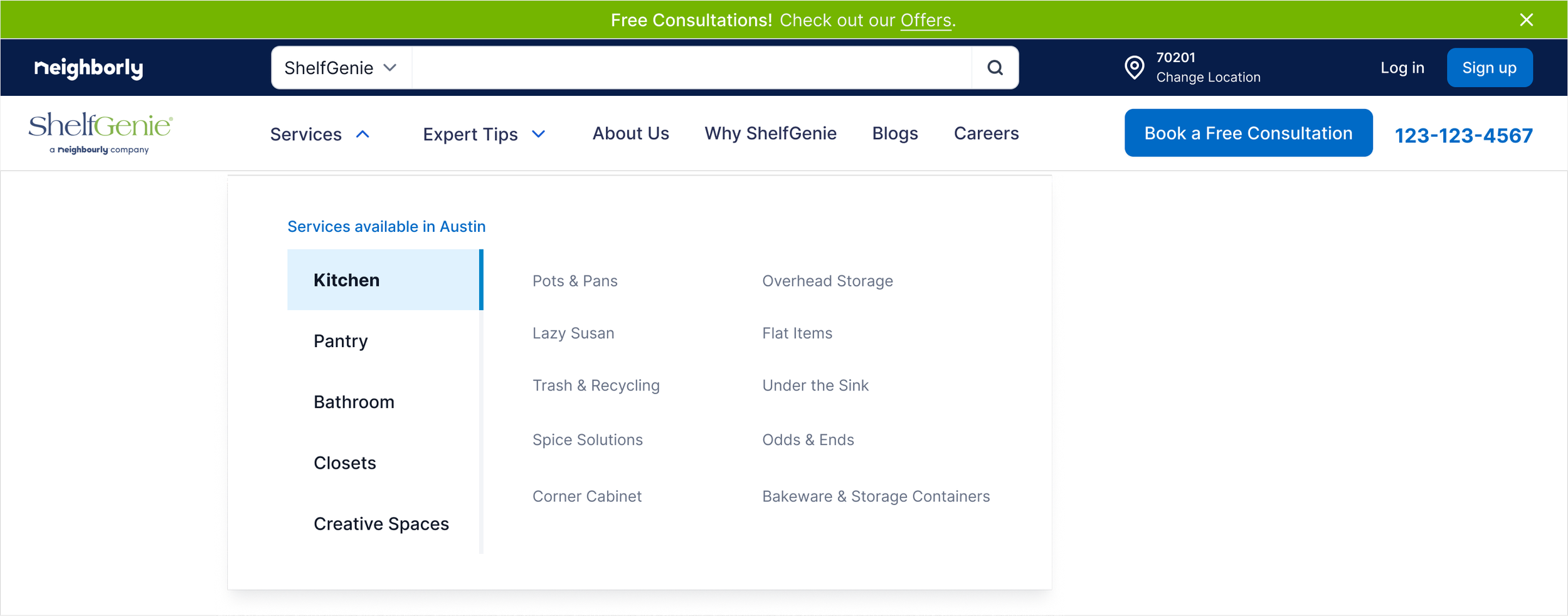
Service Pages Level 1,2,3
The existing service level pages were unclear and lacked a clear structure. In the new design, each level guides users to the next step with links to more detailed information. While each layout has slight variations to reflect the different levels, they maintain a consistent visual structure for easy navigation.
We also reintroduced relevant content from other pages to give users more context about what the company offers, making the service options easier to understand.
ShelfGenie NEW Service Levels

Sprint 3
Location page
Each sub-brand had a different approach to location pages, but Neighborly was aiming to create a unified version across all brands. While the final concept was still being developed internally, we contributed ideas to help guide future direction.
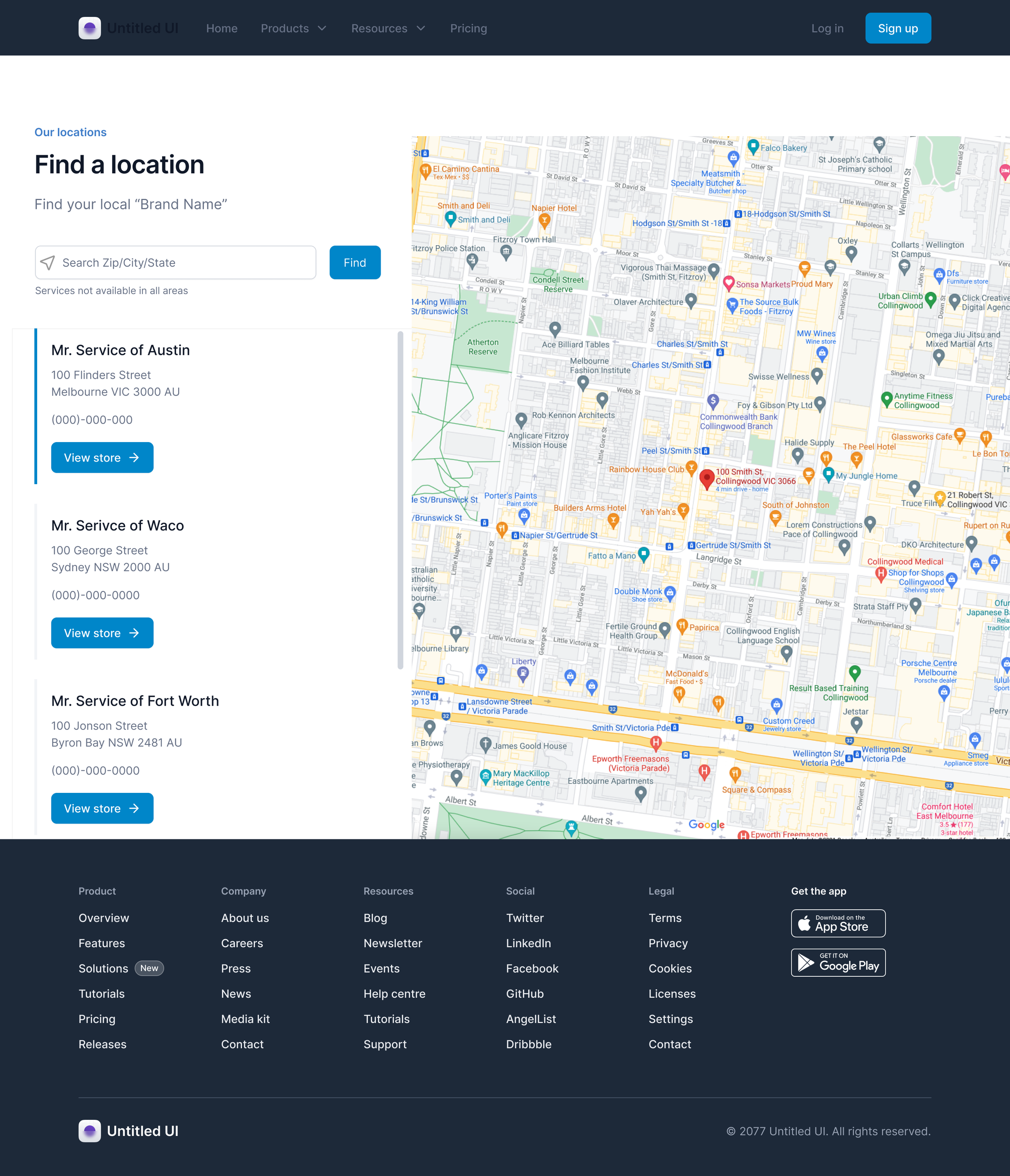
ShelfGenie NEW Locations (concept)
Header & Footer
Sticky Header Design
The header was designed to stay fixed while scrolling and included several key elements to improve usability:
A search bar with a dropdown to search across all Neighborly brands
An ad banner linking directly to the offers page
Clear and accessible CTAs, so users can easily take action without searching the page
Expandable dropdown menus, organized vertically to support future category growth
Updated section titles for easier navigation and better content clarity
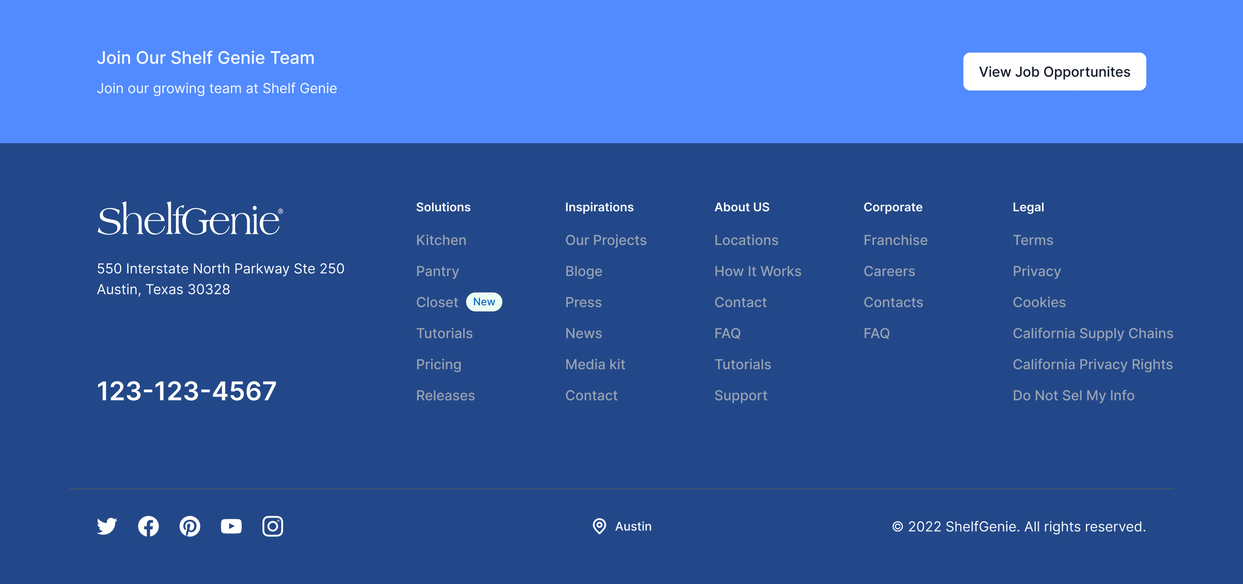
Footer Design
The footer was designed to provide essential information while staying flexible for future updates. Key elements included:
Local service logo and address
Contact numbers for easy access to support
Social media icons to encourage user engagement
Common footer links, like Solutions, Inspiration, and About Us
A location pin indicator to reflect the user’s local service area
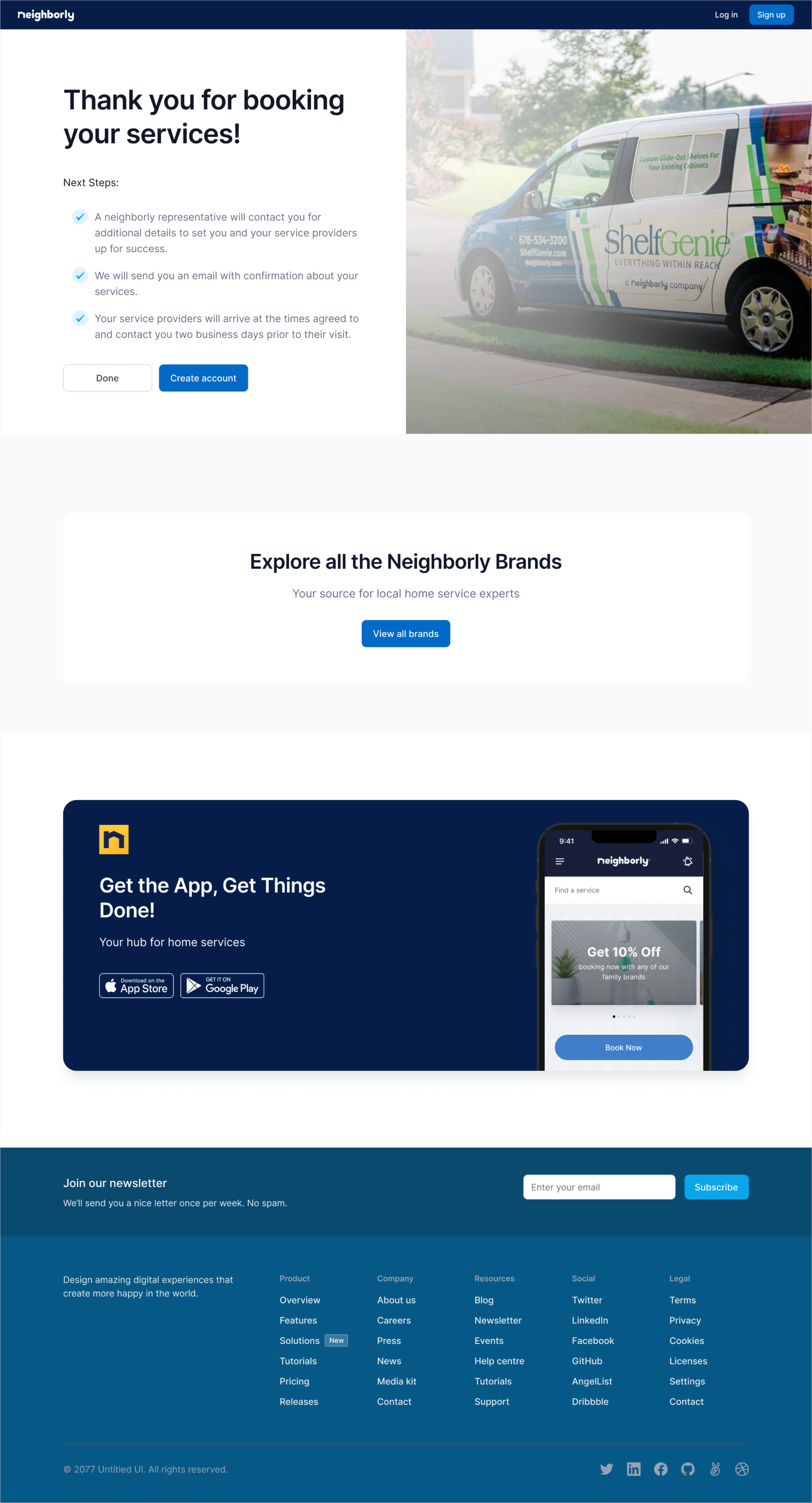
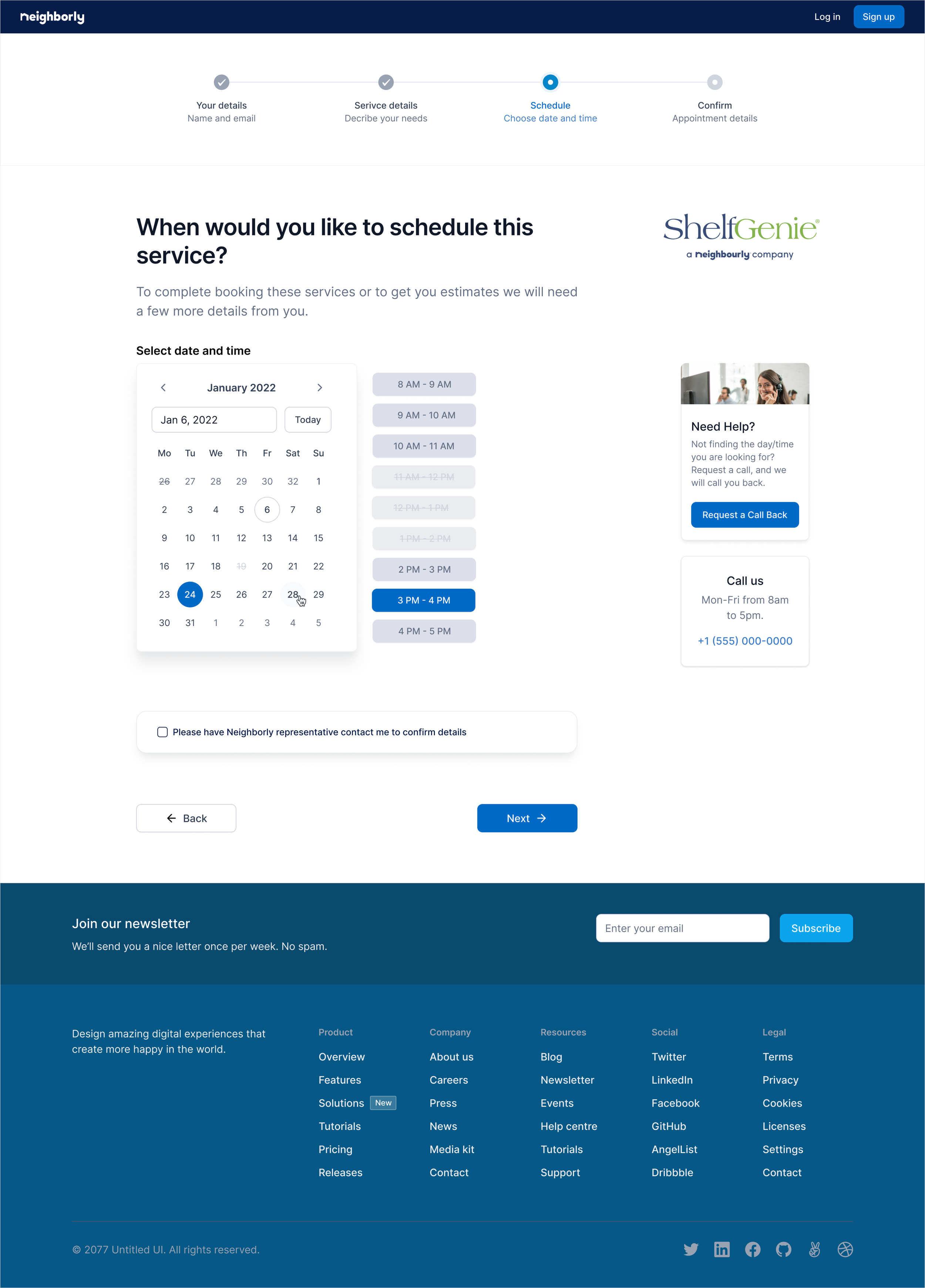
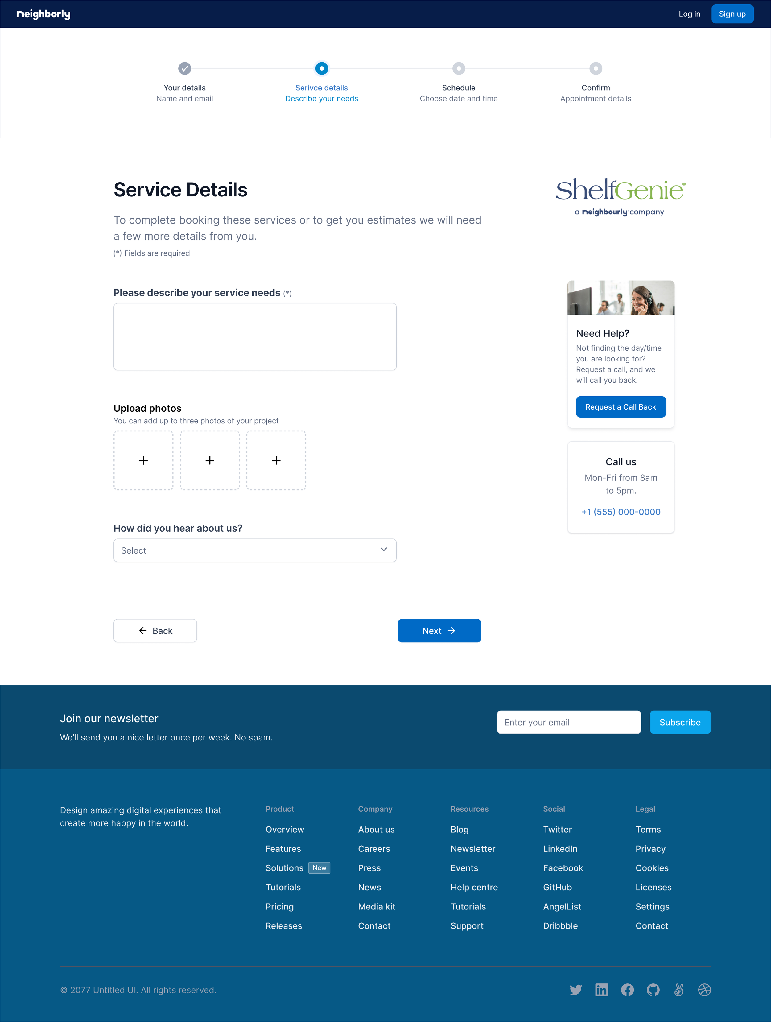
Once a user decides to book a service, a unified service flow was needed. This flow should align with the app experience and follow the same structure as other shared pages on Neighborly.com, such as account creation.
Booking pages
Conclusion
With helpful feedback from the Neighborly team—most of it positive—we continued improving the designs to create a user-friendly and consistent experience. Our goal was to build a flexible template that works across all sub-brands while still keeping each brand’s identity clear. This approach makes it easier for users to understand what Neighborly offers and book services in one place.
Working within a tight timeline, we used agile methods and design systems to quickly deliver updated pages, including the homepage, service flow, and key content pages like "Why Us" and "About Us." We also aligned shared features—like account creation and booking flows—with the app experience.
User testing helped us spot areas for improvement, such as simplifying layouts, making content easier to scan, and offering location-based recommendations. These insights will guide ongoing design updates through future iterations and implementation.