Streamlining Sweetgreen
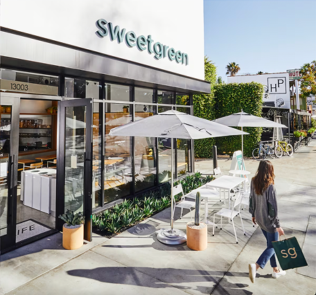
Sweetgreen, founded in 2006, is a fast-casual brand with 240+ locations that prioritizes real food, responsible sourcing, and sustainable practices reflected in choices like their compostable Hex Bowl.
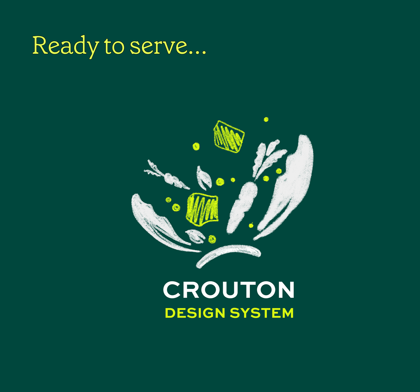
A crouton is the ingredient that brings the salad together. The Crouton Design System is our shared language for building experiences that feel like Sweetgreen: simple, intentional and human. It is about making healthy choices feel simple, joyful, and human.
Project Overview
Client:
Sweetgreen
(Unofficial)
Timeline:
September 2025 - December 2025
(3 Months)
Team:
May Kim, Roshni Ganesh, Keertana Gunnam, Joanne Li
We are:
Pratt Institute IxD Students &
Product Designers
Without an existing design system, Sweetgreen faced design inconsistencies, navigation challenges, and scaling barriers across its growing digital experience
What did we do?
My Role:
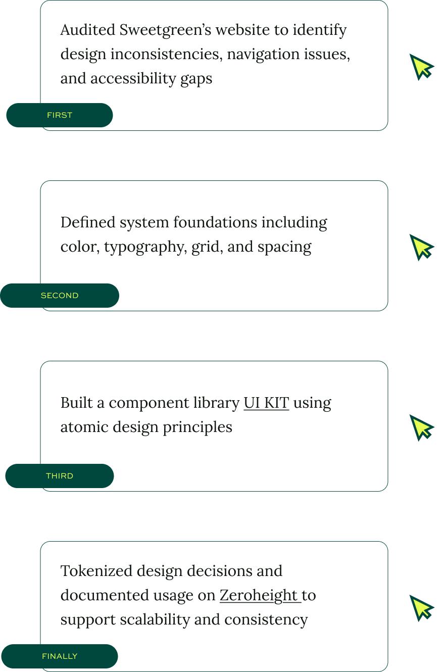
Deconstructing Website
Identify Incosistency
Create Documentation
Creat UI System
The Fallcilitator of the Team
Lettuce Begin 🥬
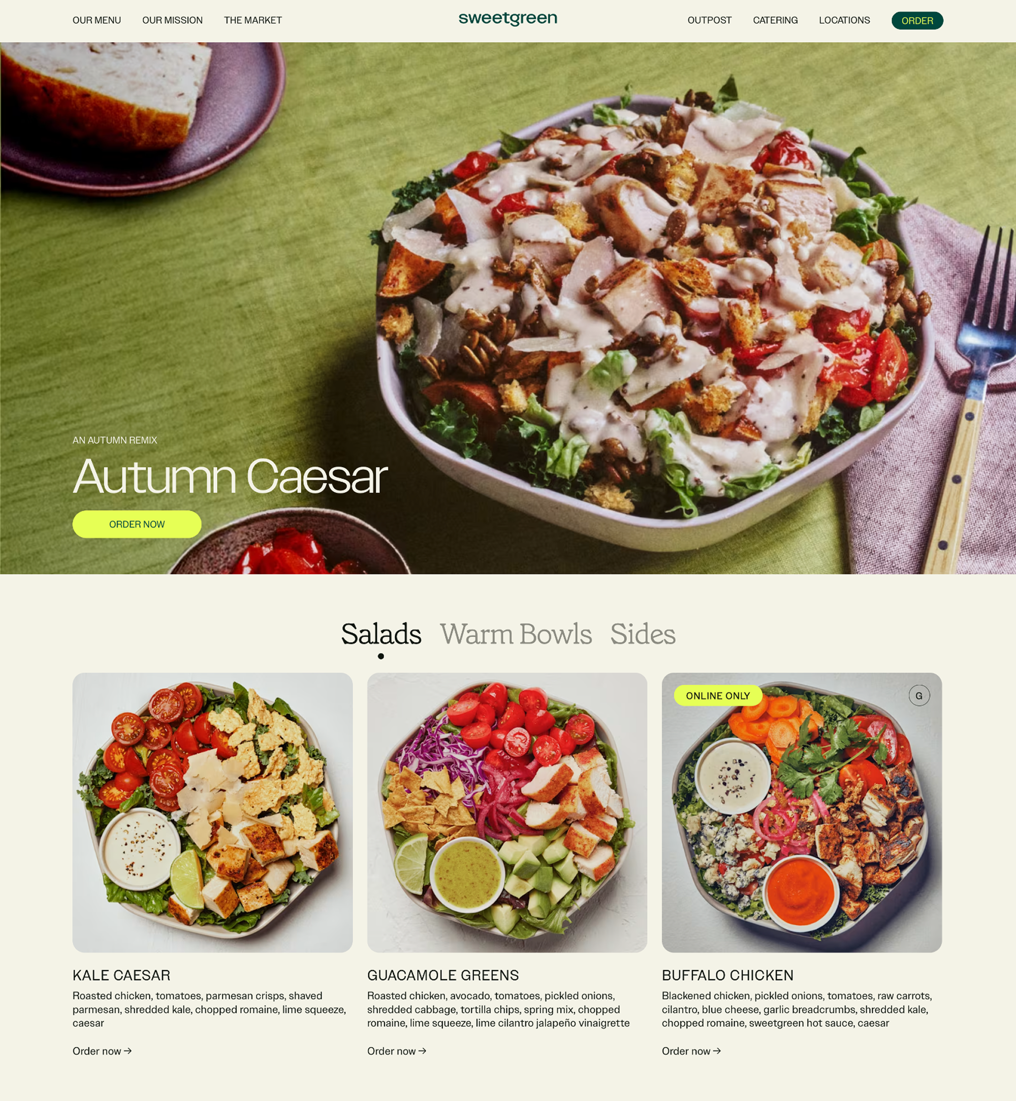
What is Sweetgreen?
Sweetgreen is a fast-casual “salad” restaurant brand focused on real food, responsible sourcing, and building healthier communities.
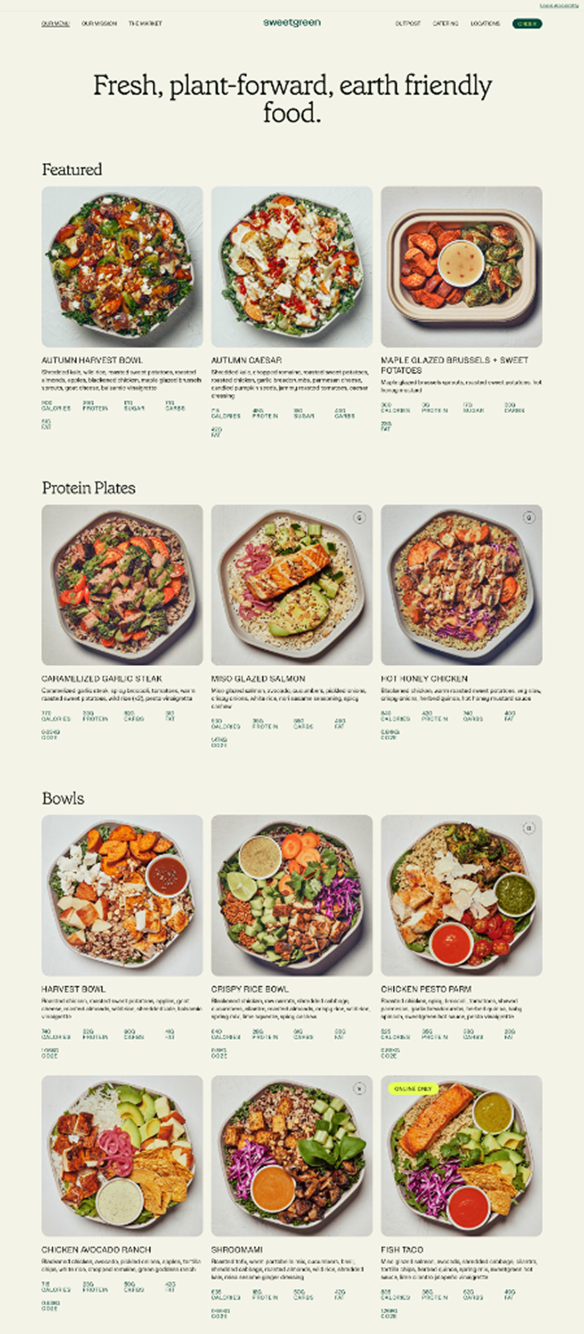
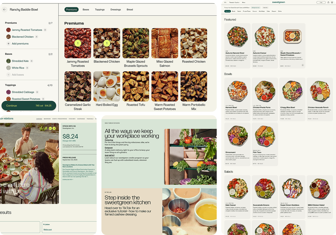
Since Sweetgreen currently focuses more on mobile ordering, the website feels less polished compared to the app.
Problem
So, why does Sweetgreen need a Design System?
The answer came down to a few core challenges:
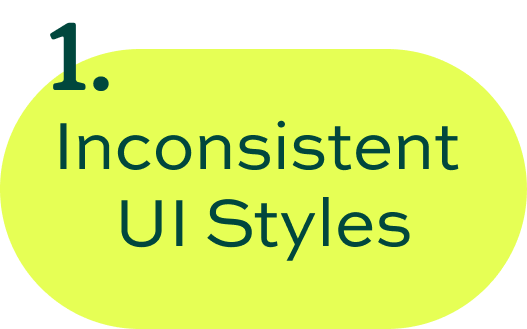


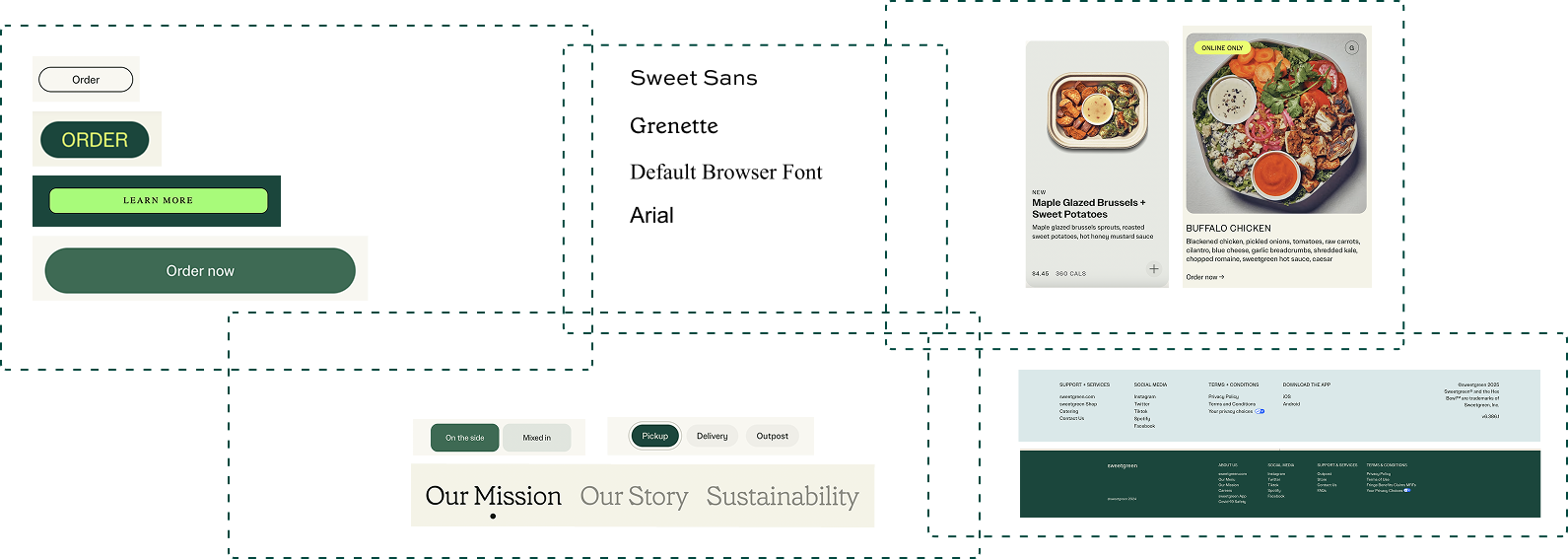
1. Inconsistent UI Across Pages
There were Design misalignment and accessibility gaps weakening brand’s digital experience.
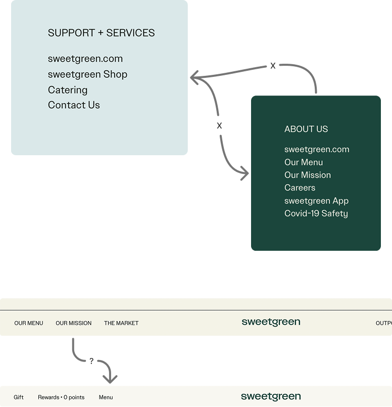
2. Navigation Pain Points
Navigation patterns caused friction making the site to feel disconnected.
Especially when interacting with the navigation bar and in the footer.
3. Brand Growth Consistency Challenges
As Sweetgreen’s digital presence expands, there seems to be difficulty maintaining consistent design and user experience across pages.
Solution
It’s Time for a Fresh Mix!
Why Throw Crouton into the Mix?

Keep it Fresh and Simple:
Clean components, no clutter, and everything in the right place
allowing teams to focus on building, not rethinking and reworking.
Design for Everyone:
Crouton Design System helps design for everyone.
Accessibility isn’t an afterthought but is baked into every component.
Feel Autentic and Human:
Sweetgreen’s designs should reflect its focus on people, food, and community, feeling thoughtful, meaningful, and human, like sharing a great meal.
Breaking it down & Building it Up
How did we create Crouton Design System?
Crouton follows an atomic design framework based off of Brad Frost’s: Atomic Design Methodology
“Crouton helps toss together cohesive, thoughtful, scalable experiences.”
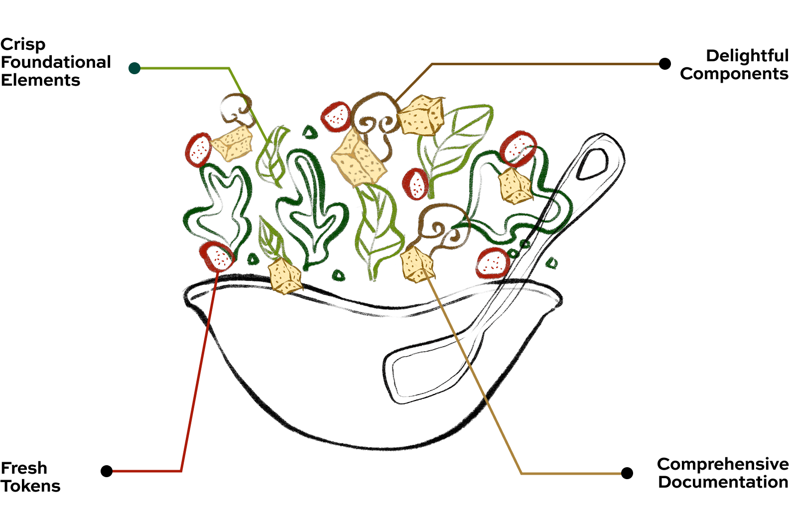
01. Define the foundational elements
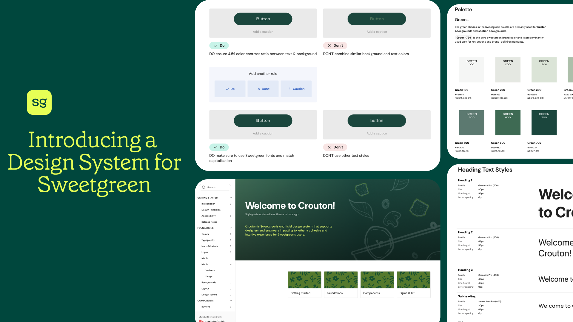
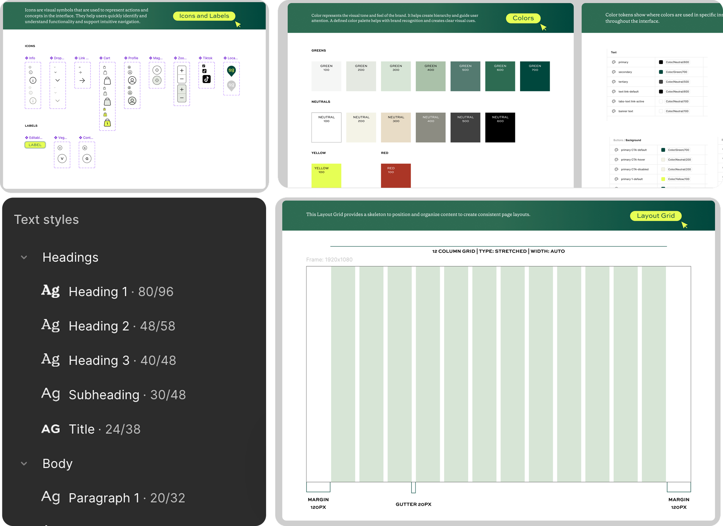
By standardizing tokens, colors, typography, grids, and icons, we create one shared design language bringing consistency to every component and every screen
A strong style guide keeps the salad balanced, so every component that follows tastes like Sweetgreen.
This consistency strengthens brand recognition, makes experiences feel intentional and builds trust with users!
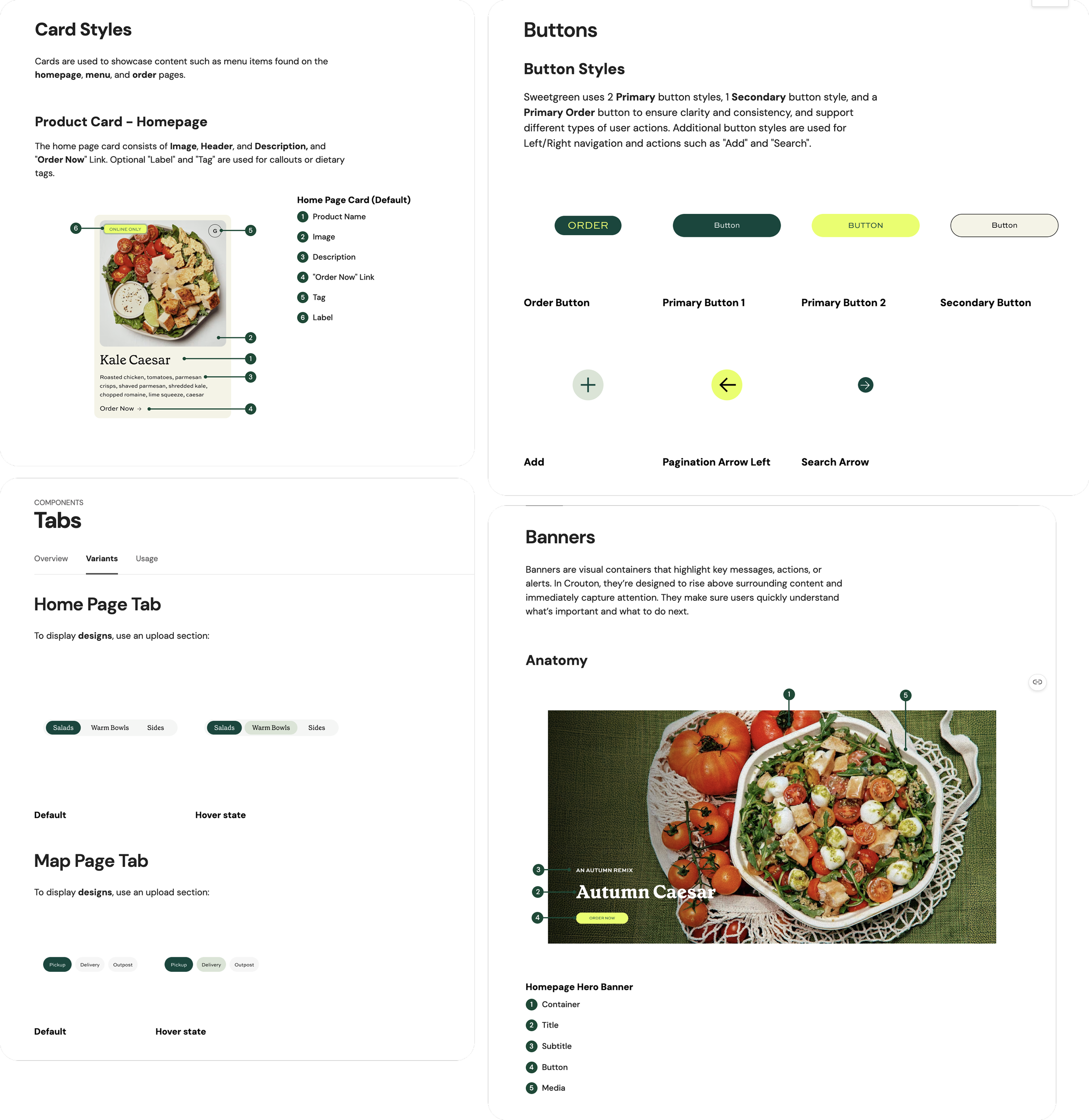
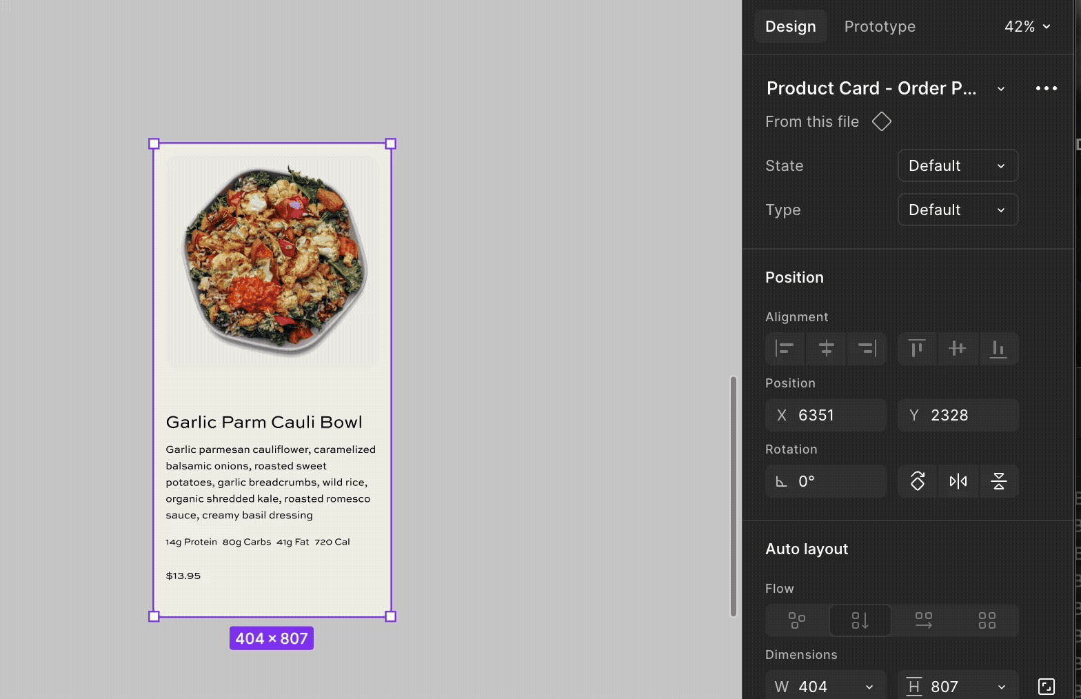
02. Reusable Components: Molecules & Organisms
There were many elements across the site, all designed in their own way.
Imagine having to rebuild the same element again and again. That's why building a system of components, ranging from complex cards and banners with dense information to atoms like buttons and links is important.
These reusable pieces keep the experience consistent and scalable. Now teams at Sweetgreen can move faster and build without all the busywork!
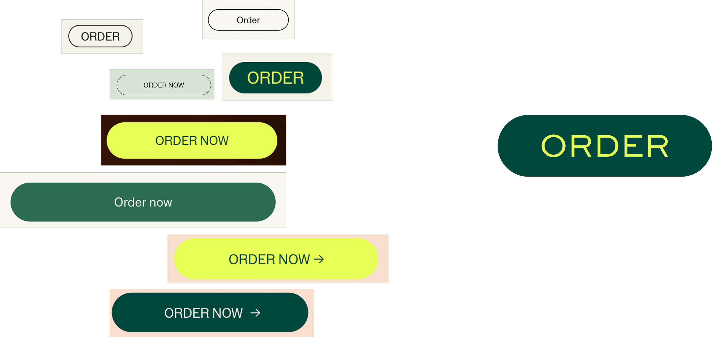
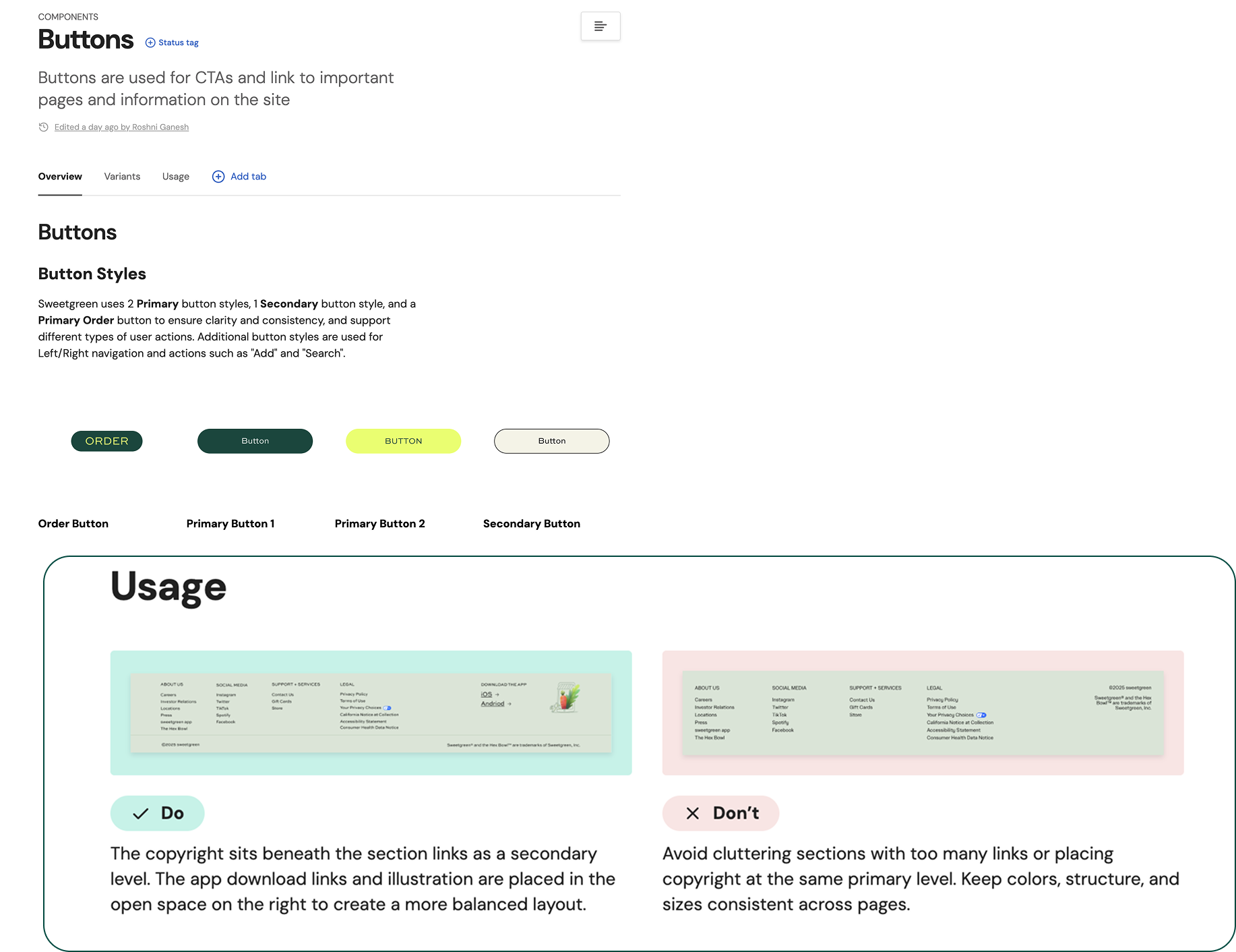
Buttons.. Buttons… and More Buttons…
There were multiple versions of the Order Button with many different styles, creating visual inconsistency and added unnecessary complexity for designers and engineers.
So we consolidated all of those variations into one unified component that could be used throughout!
Now Prepping…
The UI Kit makes it easier to design for Sweetgreen.
Think of it like a puzzle! Our components snap together to create experiences efficiently
Inclusive Design
Accessibility Matters in Crouton Design System
The Crouton Design System prioritizes inclusive design practices following the WCAG 2.0 guidelines, to create interfaces that are usable and accessible to users with diverse abilities and preferences.
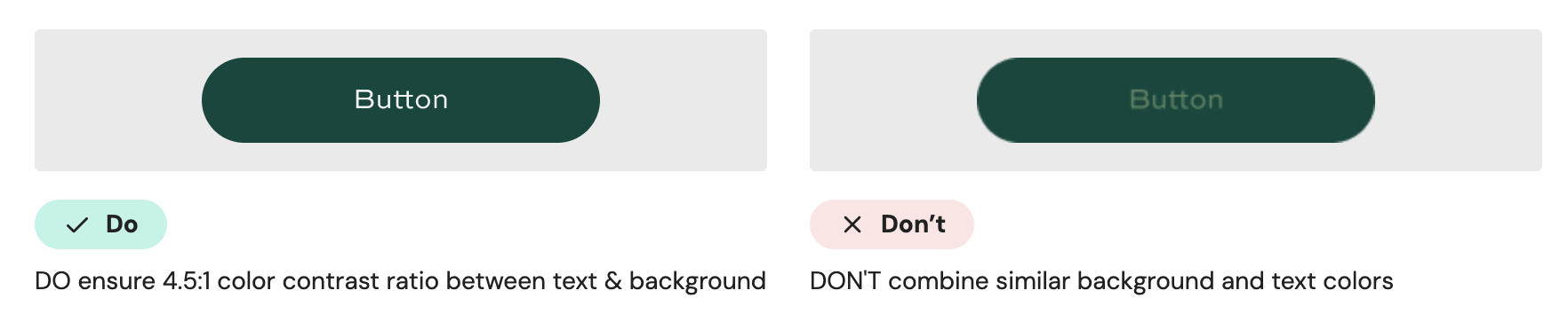
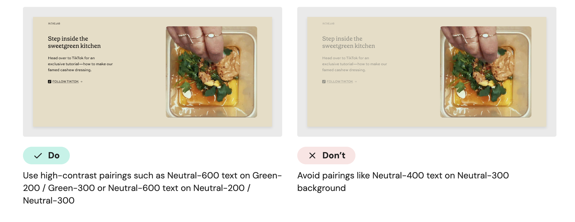
Color and Contrast
Use color and typography intentionally to ensure every user can clearly understand what’s being communicated.
Typography
Use readable text sizes
WCAG 2.2 recommends a minimum of 16pt for clear legibility.
Maintain a clear hierarchy by using the provided text styles to establish a scannable layout structure.
Content & Clarity
Write clear, concise copy by avoiding jargon or overly complex phrasing to ensure comprehension for everyone.
Ensure keyboard accessibility
Never assume users are using a mouse or touchscreen.
All interactive elements should be usable via keyboard (Tab, Enter, Arrow keys)
Visible focus states must be clearly distinguishable
Now we made the salad, time to dig in!
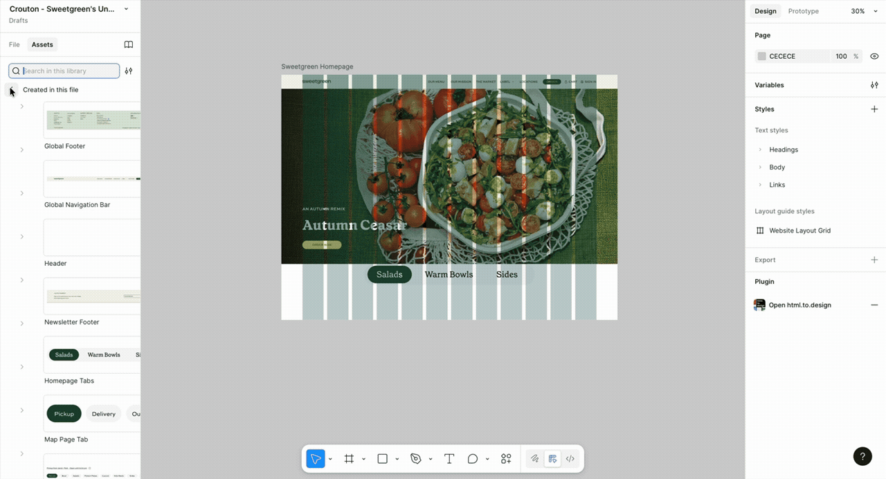
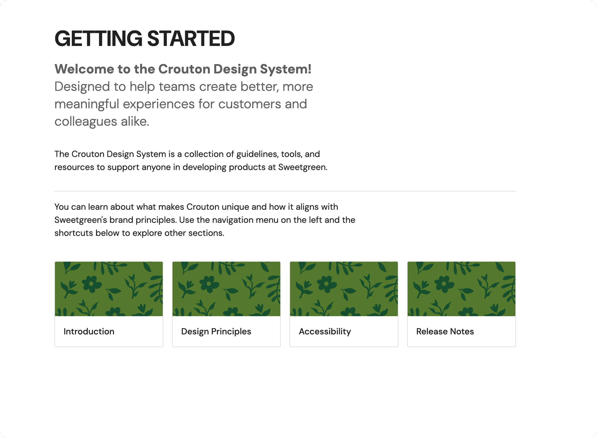
Documenting the Site
The Zeroheight site serves as a central resource for designers, developers, and system users to easily learn and apply Sweetgreen’s design patterns and guidelines
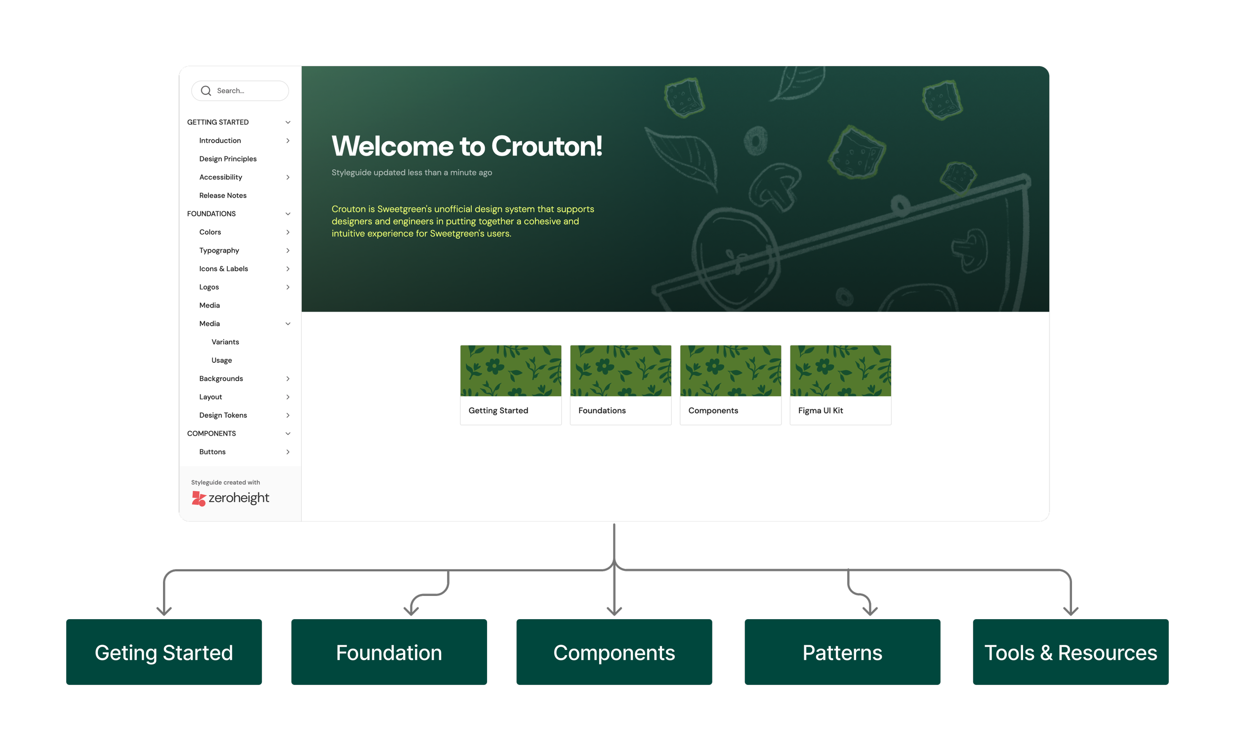
Onboarding
Onboarding pages do the heavy lifting so new users don’t have to. It has separate onboarding guidelines for designers and developers, an introduction to design principles, and accessibility guidelines so users can tap in, learn fast, and get going. We also provide a way for any user of the system to contribute to the system
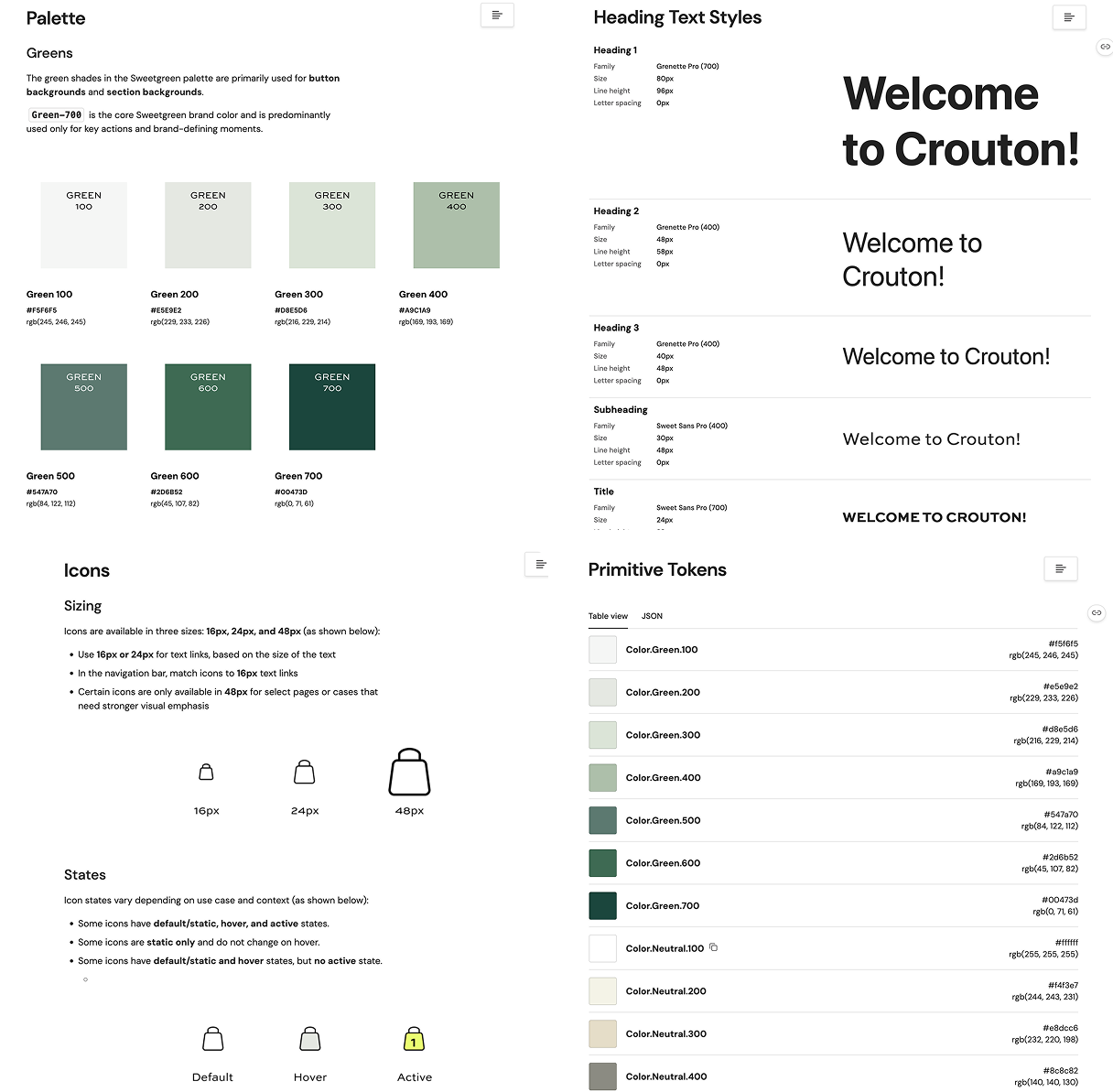
Foundations
Foundations on the document site includes core visual style (color and typography), brand expressions, like icons and logos, and structural elements, like layout and tokens.
Component Variants & Usage
Component design is described by outlining the anatomy of each component and showing the different variants we created, such as default, hover, and disabled states. The usage tabs show exactly how and how not to use the components, supported by both text and visual examples, along with accessibility guidelines to ensure all users can interact with the content comfortably.
“Crouton helps designers, developers, and stakeholders align through clear components, tokens, and guidelines that streamline Sweetgreen’s digital experience”
Crouton Design System Features:
🥗 Comprehensive UI Kit
🥙 Documentation with Resources
🥬 Crouton Pitch Deck
Project Highlights
Usability Testing of UI Kit Conducted midway to evaluate how users understood and applied the Crouton UI Kit.
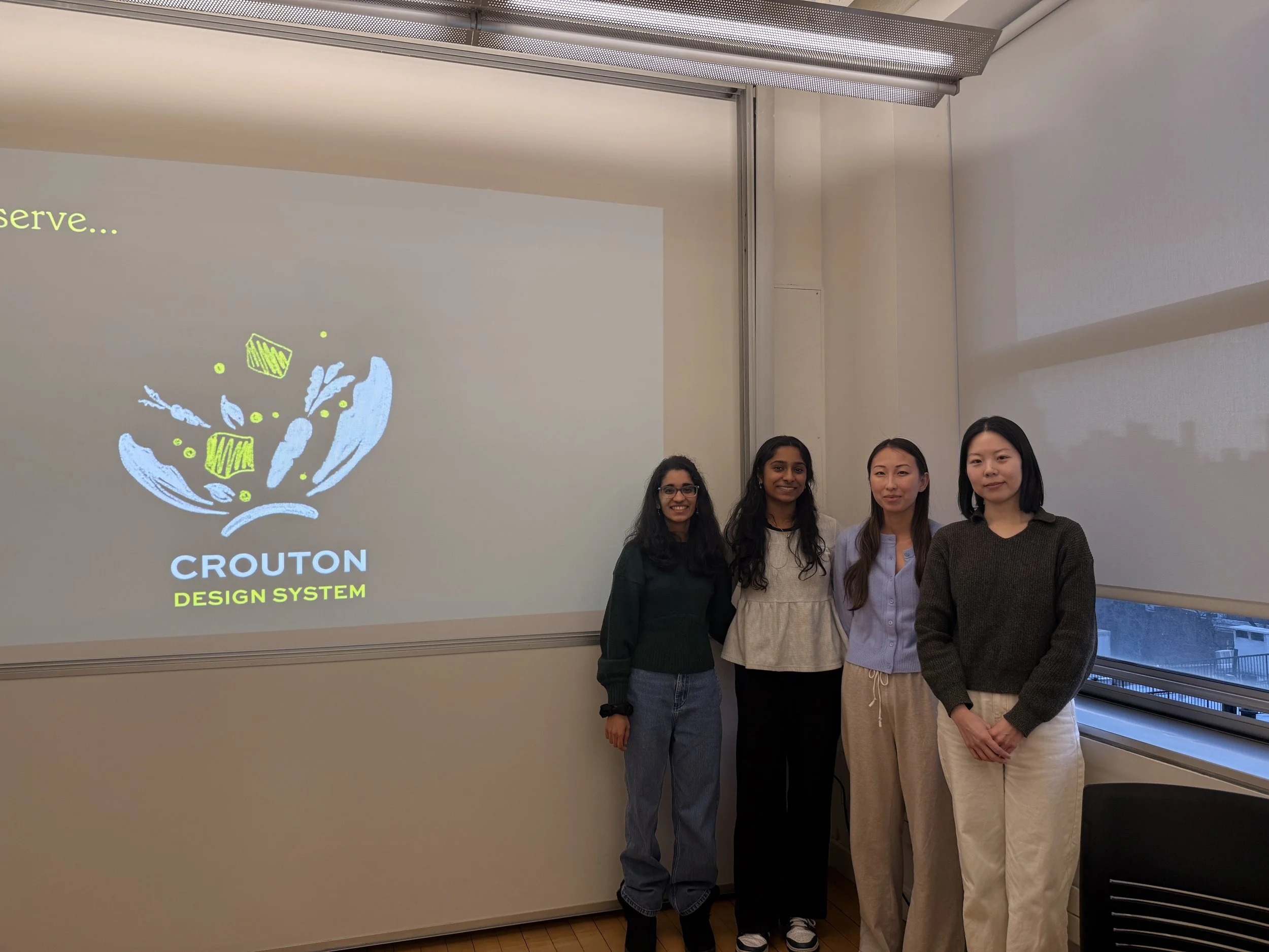
Final Pitch Delivery
The Crouton design system was successfully presented following three months of development
Conclusion & Final Takeaways
Crouton Design System establishes a more structured, scalable foundation for Sweetgreen’s digital experience by aligning components, tokens, and accessibility standards. It supports designers, developers, and stakeholders to build consistently and confidently as the product evolves.
Through building Crouton, I learned how to apply structured designs to create a UI kit supported by clear documentation. The process gave me a stronger understanding of the value in design systems over individual solutions, along with the importance of designing for accessibility, consistency, scalability, and long-term maintenance intended to evolve over time.
What can we do further down the road?
Designing more Components
Expanding the design system to support additional component categories, such as the further flow the order page, and patterns as Sweetgreen’s digital experience continues to grow.
Crafting Mobile Experience
Extending the design system to better support mobile interactions and ensure a consistent, intuitive experience across devices.
Conducting more Accessibility Audits
Perform ongoing accessibility audits to identify gaps, validate WCAG compliance, and continuously improve the system’s inclusivity.
“Design systems are culture change desinged as a UI Kit”