CashCow : Credit Card Benefit Tracking Website
Saving Money on Purchases by Tracking and Applying Credit Card Benefits

About
As a student project for Information Architecture and Interaction Design Fall'24 course at Pratt Institute, our team was given the design prompt:
A website for optimizing purchases and saving money through a user’s existing credit card and bank account benefits.
My Role: Student UX/UI Designer
Tools: Figma, FigJam, Miro, Google Docs, Adobe Illustrator
Timeline: August - December 2024 (4 months)
Team: Team of 4 masters student designers under mentorship of Professor at Pratt Institute
Introduction
After identifying the key areas of overlap in our research, our team defined three initial constraints for the design prompt:
benefits must be accessed through credit cards
users must be credit card holders
purchase type is placed online
While these constraints helped narrow the scope, they didn’t yet provide a clear direction for our design. We were still asking broad questions like, “How can we optimize credit card purchases?”and “Which benefits should we focus on?”
To sharpen our focus, we decided to conduct secondary research. Our goal was to better understand the range of benefits offered by different credit cards, as well as explore existing tools that help users manage or take advantage of those benefits.
Research
Secondary Research
As we narrowed our focus to credit card benefits for online purchases, we found that cash-back and rewards cards are the most popular among U.S. users.
We also looked at platforms like Capital One Shopping and MaxRewards, which offer mobile-first features like auto-applied coupons, price comparisons, and rewards tracking. This pointed to a clear user expectation: seamless, on-the-go benefit management—something we kept in mind for our design.
Primary Research
In order to design a product that can better optimize purchases and help users save money through their existing credit card benefits, our team conducted interviews with four different credit card users as well as three contextual inquiries and one observation to observe the context in which users make purchases using their credit cards. In doing so, we hope to gain a better understanding of credit card users’ money-saving experiences and values.
User Interview on how user uses credit card benefit
Analysis
To find patterns in the pain points from our Affinity Diagram, we created a Mental Model. In the Problem Space, we saw that users want to use their cashback benefits more often but struggle due to managing multiple cards and finding relevant offers. From there, we mapped out potential features in the Solution Space to directly address each of those challenges.
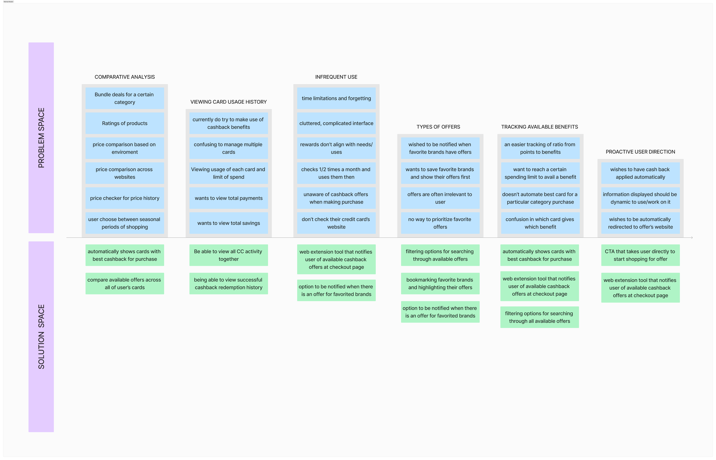

While building our Mental Model, we noticed key differences between single-card and multi-card users. To capture this, we created Archetypes for both user types. We also developed a Task Model to better understand when and how users would interact with our solution during their purchase journey.
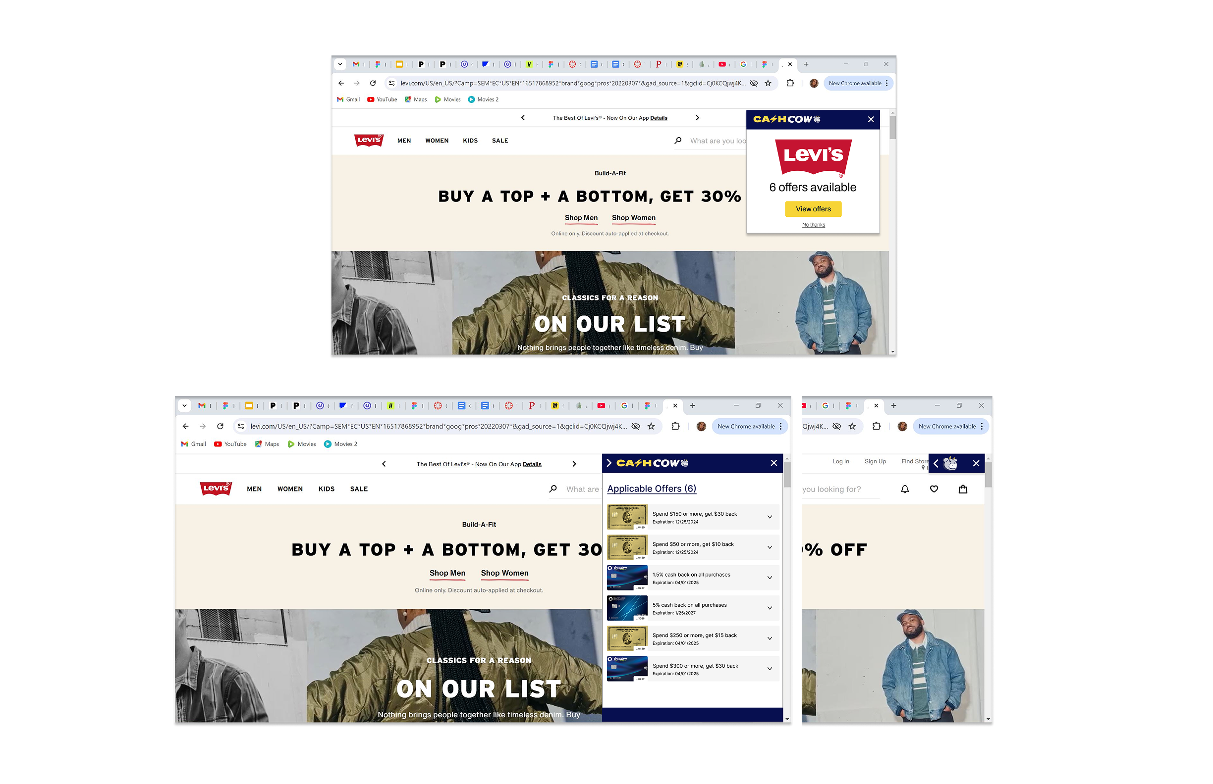
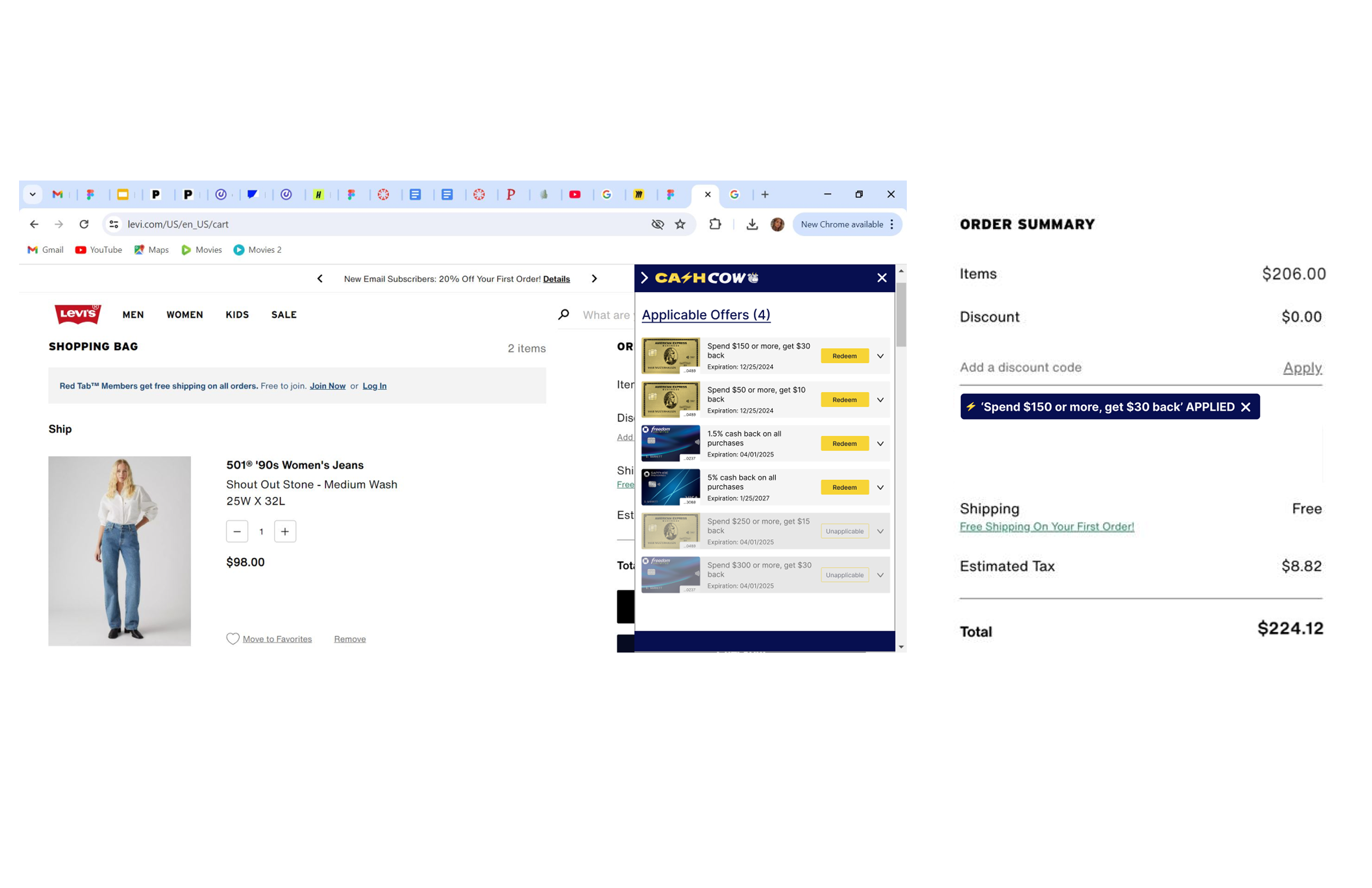
The flow supports two entry points: users can either start on a product site—where our extension shows available benefits during checkout—or begin on the CashCow site to browse or search offers tied to their cards. Both paths lead to the same final step at checkout, ensuring users can apply relevant savings.
Solution
From the three main themes in our affinity diagram, we chose to focus our design on helping users compare cashback offers across all their credit cards in one place. This would make it easier for them to take advantage of their existing benefits and save more on online purchases.
However, after reviewing our archetypes and task flows, two important questions came up:
How can we help users maximize savings at the moment of purchase?
How can we design for both single-card and multi-card users?
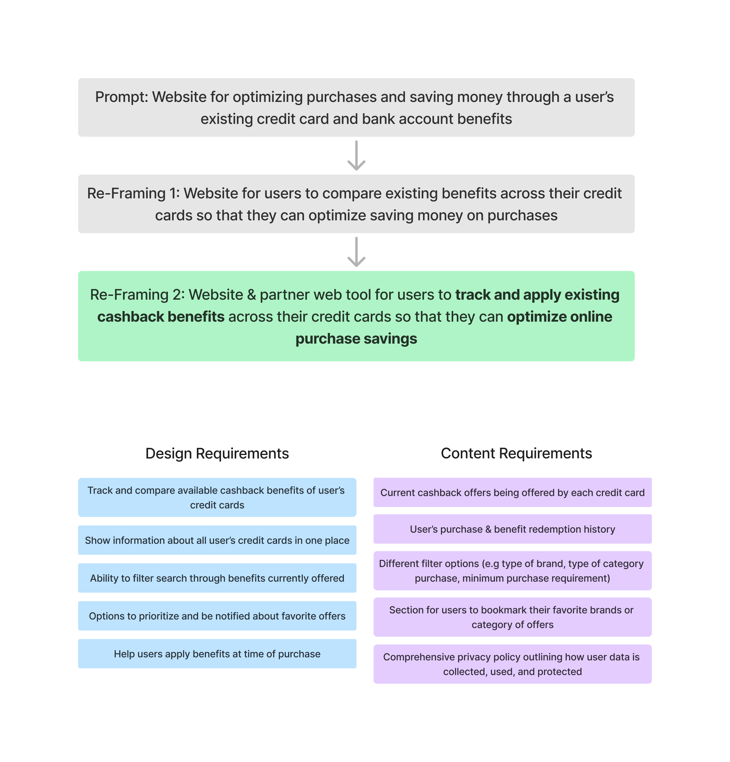
Our solution was to create a single website where users can view and compare cashback offers across all their credit cards. One key issue we identified was that users often forget to use their benefits or struggle to find relevant offers. To address this, we proposed a web tool that automatically displays available cashback deals when users visit shopping sites—both on the homepage and at checkout.
Information Architecture & Sitemap
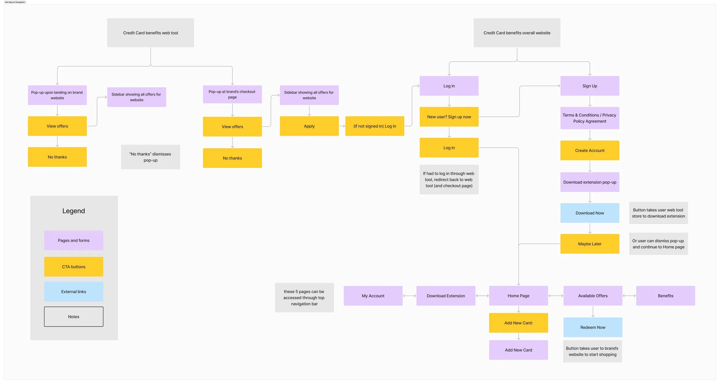
With our design frame and content requirements in place, we created an Information Architecture (IA) and Sitemap to map out the product’s overall navigation. These helped support our Task Flow model by showing where and when users would interact with the product during their shopping journey.
We built the IA by outlining all key pages and their content, ensuring our design and content requirements were covered. Each page included a checklist of elements—such as CTAs, content, and external links—to guide the design process later on.
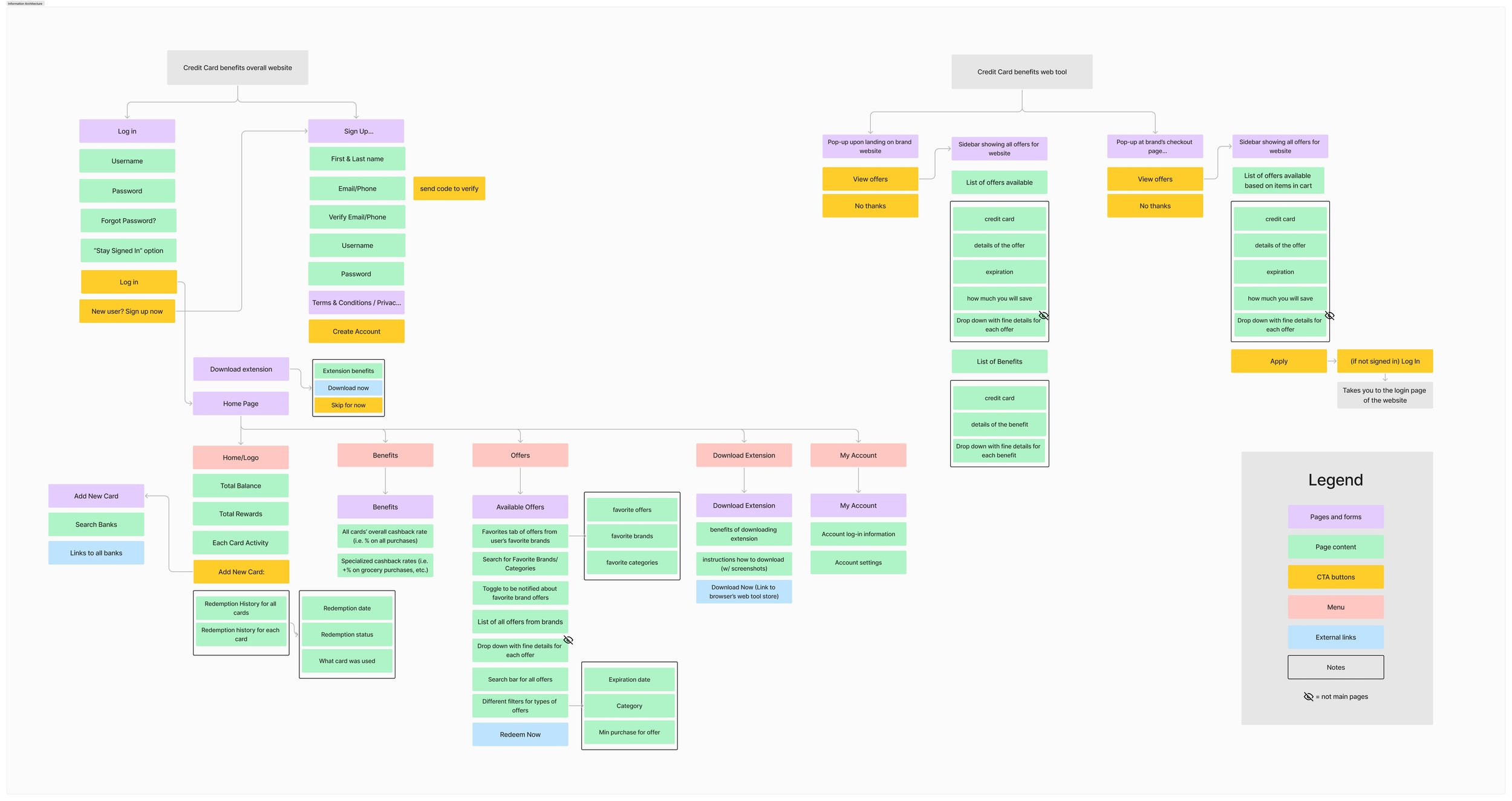
After finalizing the IA, we created a Sitemap to illustrate a simplified view of how pages and screens connect. Unlike the IA, the Sitemap focuses on the overall navigation flow between sections of the product.
Wireframes
With all our research and planning in place, we moved on to creating low-fidelity wireframes. This step allowed us to quickly explore and iterate on different ideas and use cases in visual form, helping us identify the most effective design directions to carry forward.
Based on our insights and feedback, we prioritized the following screens for our first prototype:
the homepage,
benefits page
offers page
the web tool extension

Branding & CIS Design
To complete our high-fidelity prototype, we finalized the product name and branding. We wanted something that felt like a trusted shopping companion focused on saving money.
We chose the name “CashCow”—a playful take on the idea of a "cashback-counting" tool and the business term cash cow, which refers to something that delivers steady, long-term value.

After deliberating, we settled on navy & yellow-gold as the primary brand colors, and we designed logos & icons related to cows, coins, and energy to communicate the feeling of a dependable and motivated shopping companion.
Prototypes
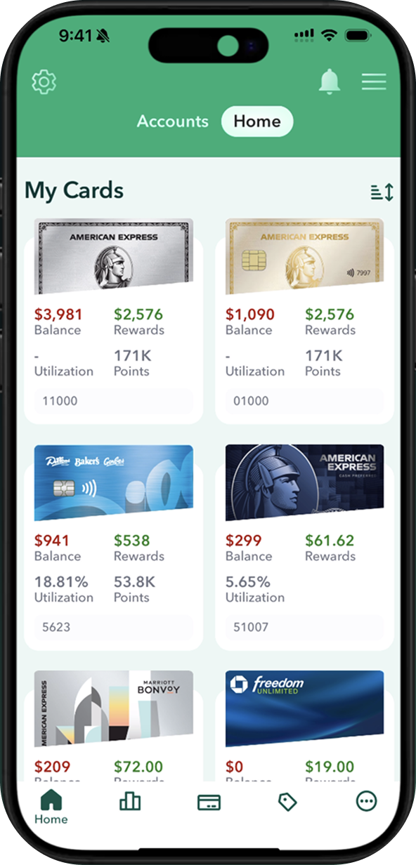
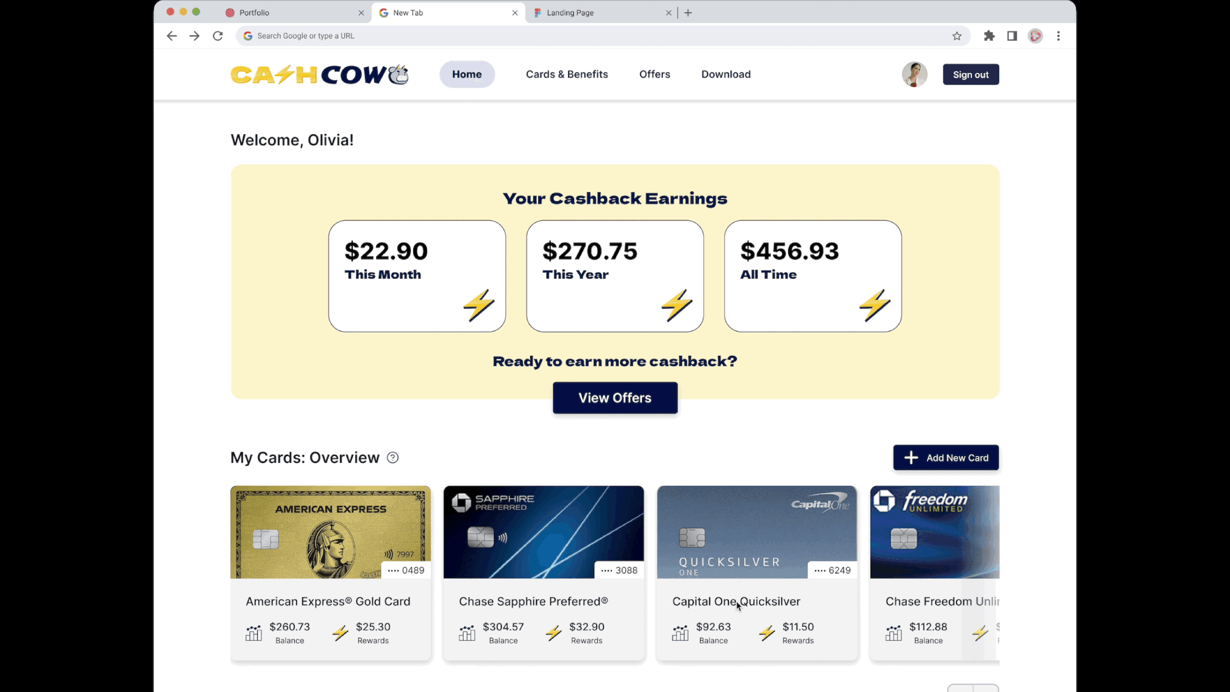
The homepage highlights key info at a glance—current savings, card activity, and the option to add new cards. Users can view their offer redemption history, including earned and pending cashback, with filters and search to explore past redemptions.


When the user lands on a third-party site (e.g., Levi’s), the CashCow web tool appears as a popup showing available offers. Users can view or dismiss it; viewing expands a sidebar with all offers. The design matches the main site for easy recognition, and the tool can be minimized to a top-right icon to avoid blocking the page.
Final Prototype
Usability Testing
After building our first hi-fi prototype, we ran moderated usability tests. Each team member tested two flows using the prompt:
“You are looking to buy a pair of high-quality denim jeans and want to maximize your savings.”
From our notes, we identified three common user issues.

Conclusion
Moving forward, we plan to conduct more user testing across different interaction flows to evaluate usability and explore additional use cases. This includes designing and testing new frames—like the onboarding process—and assessing how clearly we can communicate data privacy policies.
Throughout the design process, from initial framing to prototype testing, we gained valuable insights and technical skills that helped shape a more user-centered product.
One key challenge was addressing users' varying financial situations and concerns around privacy and security. These factors pushed us to continually revisit and refine our designs. With ongoing research, we aim to expand our flows and screens to move closer to a complete, user-ready product.